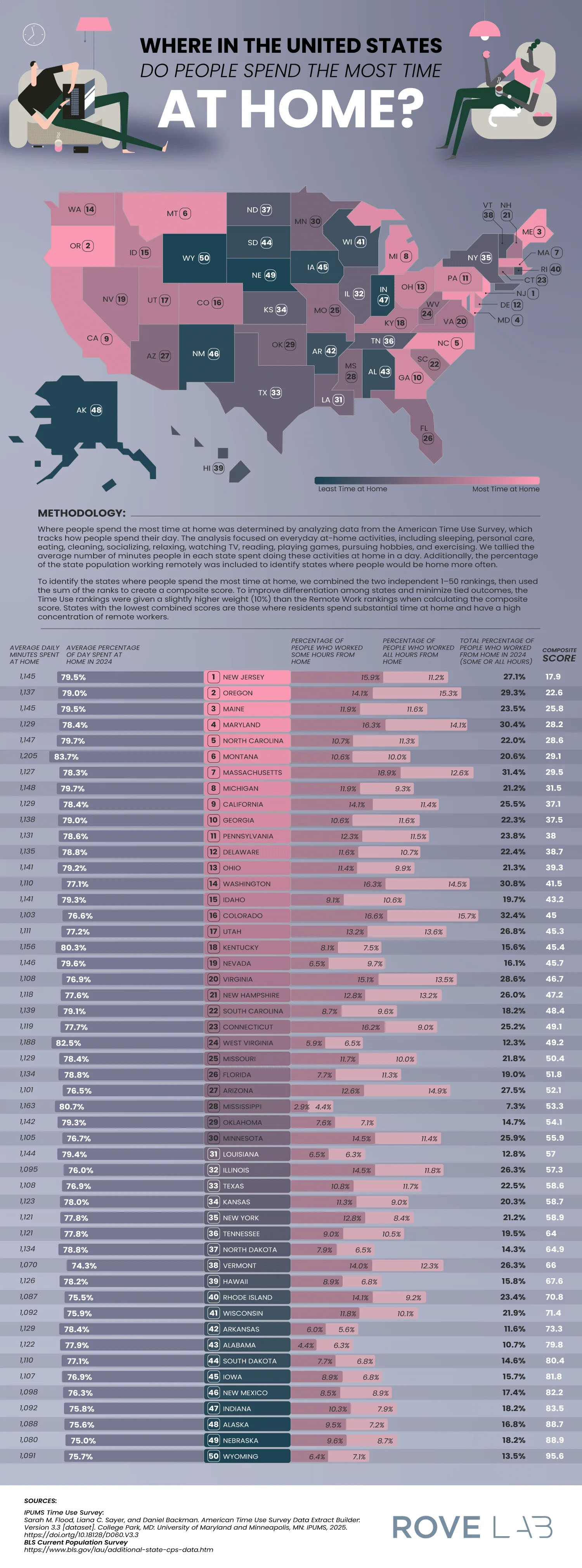
Rove Lab’s new infographic is a treasure trove of quirky regional facts. They analyzed data to identify where Americans spend the most time at home and presented the results in a map. Their results are based on time-use data and remote-work statistics that rank states. Their work turns everyday routines into something you can geographically observe.
Here are a few standout data points:
- Ranks are based on the average daily time spent at home
- Remote work rates are factored into the final scores
- States with higher work-from-home percentages tended to rank higher overall
- Regional patterns emerged across the South and Midwest
- The data is drawn from large national surveys rather than small samples
This map prompts us to consider whether our geography truly shapes our daily habits. It turns out, yes, our location can influence our routines and daily lives.


