Environmental Infographics
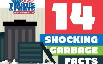
14 Shocking Facts About Garbage
Americans throw away enough garbage every day to fill 63,000 garbage trucks, which if lined up end to end for an entire year would stretch half way to the moon. In a lifetime, the average American will personally throw away 600 times his or her body weight, which for an average adult would leave a legacy of 90,000 pounds of trash at the end of their lifetime.

Heating in Space
The Universe is a place of extremes. What would happen if you were exposed to space without any protection? How does an astronaut keep cool and warm? What about the ship they travel in and the station they live in? How do things not freeze or combust?
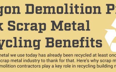
Scrap Metal Recycling Benefits
This infographic from Elder Demolition Oregon Demolition Pros explores how demolition companies recycle scrap metal, how recycled scrap metal is used, and the impact on the environment. In the United States, over 150 million tons of scrap materials are recycled which includes 85 million tons of iron and steel, 5.5 million tons of aluminum, 2 million tons of stainless steel, 1.8 million tons of copper, 1.2 million tons of lead and 420,000 tons of zinc.

Why We Need To Save The Bees
Do you know bees are incredibly vital for food production? This infographic looks at why bees are important, what will happen if they become extinct and how we can help save them.
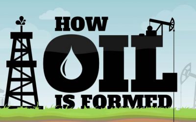
How Oil Is Formed
Those of us who imagine that striking oil means drilling into a pool of liquid riches might be surprised to learn how wrong we are. Oil is not found in underground lakes, but dispersed through rocks like a sponge. The rocks must be broken to extract the oil, which looks like mud when it is taken from the ground. Nor is it the remains of dead dinosaurs!
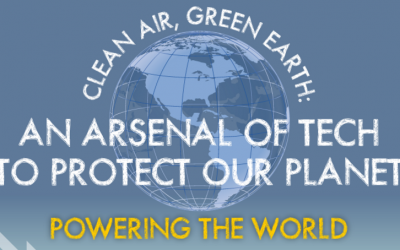
An Arsenal Of Tech To Protect Our Planet
Keeping the air clean, the Earth green and our waters blue is as important as ever for consumers, corporations and citizens in general. Tech is being used to reduce pollution in a number of different ways. Learn more about it in this infographic from Consumer Protect.
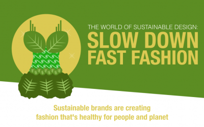
Slow Down Of Fast Fashion
Sustainability is on everyone’s minds these days, but they aren’t always thinking about how it impacts their wardrobe. Learn more about polluting fashion in the following infographic from FramesDirect.com.
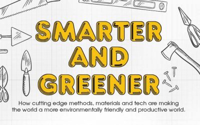
Smarter and Greener: The Future of Building
This is an exciting time to be in construction. The challenges of a growing world population and increased economic development across the world are putting an increased strain on our resources and the environment. This challenge is being met across the globe by engineers who are developing new methods of construction.
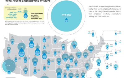
Which States Use the Most Water?
Water is a necessary aspect of life. In America, this fact is often taken for granted. Now, with the recent devastating drought in California, it’s becoming a more visible issue nation wide. This map and accompanying visualization shows the water use per capita and for different industries for each state and most populated county per state.
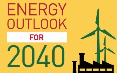
Energy Outlook for 2040
As the world tries to become more and more eco-friendly, what will energy production look like in 2040 and what is being done to make the world a greener place? This infographic takes a look at the outcomes predicted by some of the leading environmental agencies.
14 Shocking Facts About Garbage
Americans throw away enough garbage every day to fill 63,000 garbage trucks, which if lined up end to end for an entire year would stretch half way to the moon. In a lifetime, the average American will personally throw away 600 times his or her body weight, which for an average adult would leave a legacy of 90,000 pounds of trash at the end of their lifetime.
Heating in Space
The Universe is a place of extremes. What would happen if you were exposed to space without any protection? How does an astronaut keep cool and warm? What about the ship they travel in and the station they live in? How do things not freeze or combust?
Scrap Metal Recycling Benefits
This infographic from Elder Demolition Oregon Demolition Pros explores how demolition companies recycle scrap metal, how recycled scrap metal is used, and the impact on the environment. In the United States, over 150 million tons of scrap materials are recycled which includes 85 million tons of iron and steel, 5.5 million tons of aluminum, 2 million tons of stainless steel, 1.8 million tons of copper, 1.2 million tons of lead and 420,000 tons of zinc.
Why We Need To Save The Bees
Do you know bees are incredibly vital for food production? This infographic looks at why bees are important, what will happen if they become extinct and how we can help save them.
How Oil Is Formed
Those of us who imagine that striking oil means drilling into a pool of liquid riches might be surprised to learn how wrong we are. Oil is not found in underground lakes, but dispersed through rocks like a sponge. The rocks must be broken to extract the oil, which looks like mud when it is taken from the ground. Nor is it the remains of dead dinosaurs!
An Arsenal Of Tech To Protect Our Planet
Keeping the air clean, the Earth green and our waters blue is as important as ever for consumers, corporations and citizens in general. Tech is being used to reduce pollution in a number of different ways. Learn more about it in this infographic from Consumer Protect.
Slow Down Of Fast Fashion
Sustainability is on everyone’s minds these days, but they aren’t always thinking about how it impacts their wardrobe. Learn more about polluting fashion in the following infographic from FramesDirect.com.
Smarter and Greener: The Future of Building
This is an exciting time to be in construction. The challenges of a growing world population and increased economic development across the world are putting an increased strain on our resources and the environment. This challenge is being met across the globe by engineers who are developing new methods of construction.
Which States Use the Most Water?
Water is a necessary aspect of life. In America, this fact is often taken for granted. Now, with the recent devastating drought in California, it’s becoming a more visible issue nation wide. This map and accompanying visualization shows the water use per capita and for different industries for each state and most populated county per state.
Energy Outlook for 2040
As the world tries to become more and more eco-friendly, what will energy production look like in 2040 and what is being done to make the world a greener place? This infographic takes a look at the outcomes predicted by some of the leading environmental agencies.
Search 12,000+ Infographics!
Partners


Browse Archives By Category
Animated Infographics
Business Infographics
Career & Jobs Infographics
Education Infographics
Entertainment Industry Infographics
Environmental Infographics
Finance & Money Infographics
Food & Drink Infographics
Health Infographics
Historical Infographics
Home & Garden Infographics
Internet Infographics
Law and Legal Infographics
Lifestyle Infographics
Marketing Infographics
Offbeat Infographics
Parenting Infographics
Pets & Animals Infographics
Political Infographics
Shopping Infographics
Sports and Athletic Infographics
Technology Infographics
Transportation Infographics
Travel Infographics
Video Infographics