Environmental Infographics
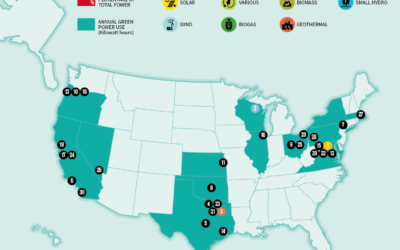
Top 30 Local Government Entities That Use the Most Green Energy
This visual map shows which government entities in the U.S. care about their carbon footprint the most. These top 30 companies have made substantial strides toward renewable energy with some providing more than 100% clean energy like the District of Columbia.
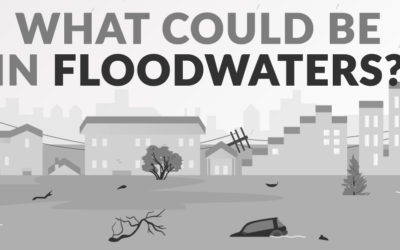
What Could Be in Floodwaters?
Floodwaters have some of the worst water quality ratings, carrying a toxic soup of contaminants. Across Mississippi, Alabama, Tennessee, and Georgia, the threat of flooding makes it essential for your safety to understand what could be in your floodwaters. Below, the team at AFS breaks down the most common floodwater contaminants, their health consequences, and what you can do to stay safe during a flood.
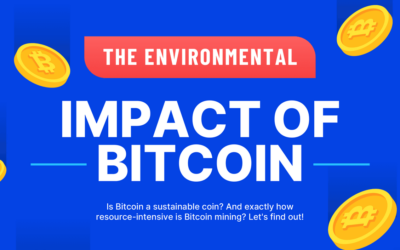
The Environmental Impact of Bitcoin
The discussion about the environmental impact of cryptocurrencies – and Bitcoin, specifically – isn’t new, but recent remarks by none other than Elon Musk have given some more notoriety to the issue. That’s why the team at Casinos Blockchain have gathered data from authoritative sources about the environmental impact of Bitcoin and turned it into a helpful infographic.
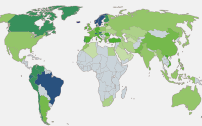
Countries With the Largest Shares of Renewable and Solar Energy
This visual graph from SolarPower.Guide shows places in the world with the highest shares of primary energy from renewable sources as of 2019. You can see the biggest leaders that have a share over 35% as of 2019 are Iceland, Norway, Brazil, Sweden, and New Zealand.

The 50 Largest Bodies of Water Ranked by Size
This infographic from TowerPaddleBoards.com shows the largest bodies of water on earth, including oceans, seas, lakes and rivers ranked by size. For example, the largest body of water is the Pacific ocean. At over 60 million square miles it covers a large portion of our globe. The Atlantic Ocean is the next largest at 41 million square miles. Then the Indian Ocean at over 27 million square miles.
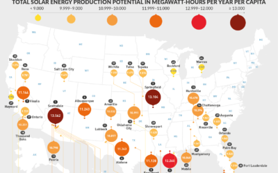
U.S. Cities with the Most Solar Energy Potential
The growth of solar power in the U.S. has been astronomical over the past decade, and costs have gone down substantially. Today, there are enough solar installations in the United States to power 12 million average homes. In this infographic, look at which U.S. Cities have the most solar energy potential.
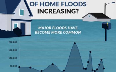
Are The Number of Home Floods Increasing?
Flood rates are changing over time, and your home may now be at risk for devastating damage from heavy rains, hurricanes, snowmelt, or overflowing streams. The National Flood Insurance Program (NFIP), managed by FEMA, provides key data to track flood damage. In the following infographic, find out how many U.S. homeowners are impacted by floods each year and the amount of flood damage.
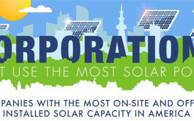
Corporations That Use the Most Solar Power
Major corporations have come under fire for high energy use and environmentally unsustainable operations. One way companies are improving is by building and using clean energy sources like solar power. Companies that use solar energy are helping to reduce harmful emissions in the environment by reducing their reliance on fossil fuels. In this infographic by SolarPower.Guide, learn which corporations use the most solar power.

How Fast is the Planet Dying?
This sheet of depressing facts is brought to you by the team at PlaygroundEquipment.com. They sat down and combed through a bunch of environmental resources, papers and studies to come up with 26 statistics that are truly terrifying. From estimates on when fresh water will run out to facts about the extinction of our wild life, this information is scary and worrisome.

The Modern Energy Market
The world of energy is changing. Renewable, sustainable energy sources are plentiful and will lead to a better world. See what StorEn is doing with the vanadium redox battery in the infographic below.
Search 11,800+ Infographics!
Partners


Browse Archives By Category
Animated Infographics
Business Infographics
Career & Jobs Infographics
Education Infographics
Entertainment Industry Infographics
Environmental Infographics
Finance & Money Infographics
Food & Drink Infographics
Health Infographics
Historical Infographics
Home & Garden Infographics
Interactive Infographics
Internet Infographics
Law and Legal Infographics
Lifestyle Infographics
Marketing Infographics
Offbeat Infographics
Parenting Infographics
Pets & Animals Infographics
Political Infographics
Shopping Infographics
Sports and Athletic Infographics
Technology Infographics
Transportation Infographics
Travel Infographics
Video Infographics