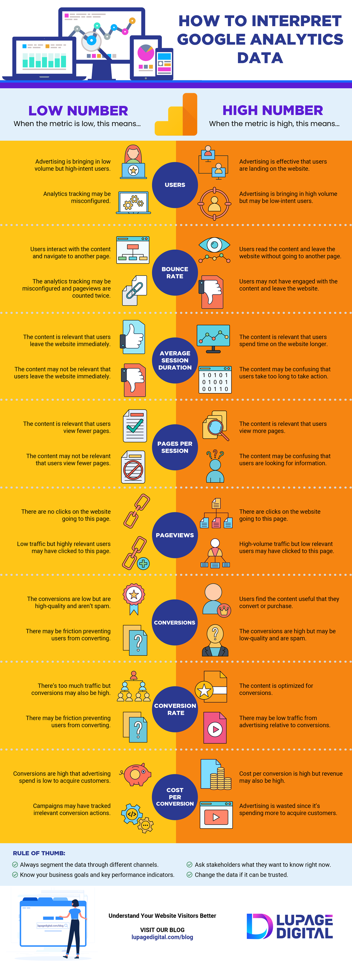
When it comes to data, there are two sides to every story. A low metric is neither good nor bad. And a high metric is neither good nor bad. Data is whatever the analyst interprets it. Here’s an infographic from Lupage Digital on how to interpret Google Analytics data a little bit better.
How To Interpret Google Analytics Data
by David Wallace | Jan 19, 2021 | Marketing Infographics


