


Search 12,100+ Infographics!

Data Science vs Computer Science vs Data Analytics
With the rapid development of the technology sector, it can be quite a challenge to keep up with all the niches and stay current on their advancements. Of the many fields that are responsible for the increasing buzz in the sector, Data Science, Computer Science, and Data Analytics are three critical domains that spearhead the revolution in technology. Where do these domains fit in? How do they differ from each other? How would you launch your career in them?

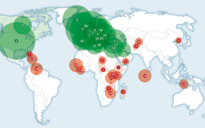
Top 20 Countries That Eat the Most and Least Protein Per Capita
Proteins are often referred to as the most essential building blocks of life. In fact, protein plays a crucial role in every aspect of living, from digestion, immune response, and communication between brain cells, to regulating hormones and building tissue. This infographic explores how countries around the world consume protein.

Top 4 Office 365 Security Concerns and Best Practices
With the number of businesses moving to cloud services like Office 365 growing every day, Cyber Tec Security looks at the most common security concerns users have and advises on some best practices to implement so you can make you’re as secure as possible.

The World’s Most Crypto-Friendly Cities
Despite the very nature of crypto-currency eluding the necessity of physical banks, the people who use digital currency do live in particular places, countries, and cities around the world. Using the physical location of bitcoin ATMs sifted by population size and local GDP’s and a scrape of self-professed crypto-enthusiasts on Twitter, this infographic uncovers some unexpected crypto-friendly cities around the world.

A Comprehensive Guide to Qualifying Leads
What if you’re dealing with thousands of leads in your contact list? It can be difficult to tell which among those names is worth investing your time and effort on. This is why you need to qualify sales leads based on the criteria set by your company or on common benchmarks within your industry. In this infographic, learn everything you need to know to make your lead qualification efforts efficient and profitable for your company.

Guide to Launching Your Cosmetology Career
Can you envision yourself with a career in the beauty industry? Whether you want to work in hair, makeup, fashion, style or grooming, the first steps you take to start your cosmetology career are some of the most important you’ll take. In this infographic, Evergreen Beauty College breaks down the six steps on how to launch a successful career in the beauty industry.
Top 20 Countries That Eat the Most and Least Calories Per Person Each Day
How many calories do you eat in a day? How does that stack up to the majority of your country? How does your country rank with the rest of the world? This infographic displays the daily caloric intake for the top 20 countries and the bottom 20 countries.

Where Can You Get the Most (and Least) Real Estate for $1 Million in the United States?
Imagine being able to purchase either 33.5 homes or just 238 square feet for the same price of one million dollars. Where would you invest? Lots of the charming small towns with good housing markets are experiencing a boom in population as younger families and singles leave the cities in search of more affordable living. This infographic shows which cities can offer the best price per square foot of real estate and which cities provide the worst.
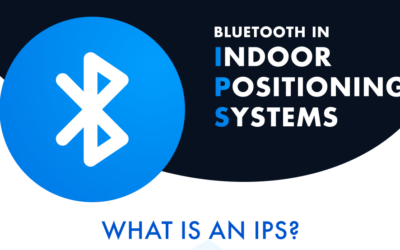
Bluetooth in Indoor Positioning Systems: Technology Overview
In this infographic, Integra Sources explores what an Indoor Positioning Systems (IPS) is and what purposes it serves. You’ll also learn about the advantages of a Bluetooth-based IPS and how different industries use this technology.

The Ultimate Metal Building Installation Checklist
Steel structures are flexible and cost-effective building solutions. Highly durable and virtually maintenance-free, metal building systems can be customized to capture any desired look or functional use. From choosing the right foundation to the selection of doors, windows, color, roof-style, etc., you need to check every aspect to ensure the correct and timely installation of your building. Follow this visual checklist to be sure your building site is ready to go on the day of installation.
Data Science vs Computer Science vs Data Analytics
With the rapid development of the technology sector, it can be quite a challenge to keep up with all the niches and stay current on their advancements. Of the many fields that are responsible for the increasing buzz in the sector, Data Science, Computer Science, and Data Analytics are three critical domains that spearhead the revolution in technology. Where do these domains fit in? How do they differ from each other? How would you launch your career in them?
Top 20 Countries That Eat the Most and Least Protein Per Capita
Proteins are often referred to as the most essential building blocks of life. In fact, protein plays a crucial role in every aspect of living, from digestion, immune response, and communication between brain cells, to regulating hormones and building tissue. This infographic explores how countries around the world consume protein.
Top 4 Office 365 Security Concerns and Best Practices
With the number of businesses moving to cloud services like Office 365 growing every day, Cyber Tec Security looks at the most common security concerns users have and advises on some best practices to implement so you can make you’re as secure as possible.
The World’s Most Crypto-Friendly Cities
Despite the very nature of crypto-currency eluding the necessity of physical banks, the people who use digital currency do live in particular places, countries, and cities around the world. Using the physical location of bitcoin ATMs sifted by population size and local GDP’s and a scrape of self-professed crypto-enthusiasts on Twitter, this infographic uncovers some unexpected crypto-friendly cities around the world.
A Comprehensive Guide to Qualifying Leads
What if you’re dealing with thousands of leads in your contact list? It can be difficult to tell which among those names is worth investing your time and effort on. This is why you need to qualify sales leads based on the criteria set by your company or on common benchmarks within your industry. In this infographic, learn everything you need to know to make your lead qualification efforts efficient and profitable for your company.
Guide to Launching Your Cosmetology Career
Can you envision yourself with a career in the beauty industry? Whether you want to work in hair, makeup, fashion, style or grooming, the first steps you take to start your cosmetology career are some of the most important you’ll take. In this infographic, Evergreen Beauty College breaks down the six steps on how to launch a successful career in the beauty industry.
Top 20 Countries That Eat the Most and Least Calories Per Person Each Day
How many calories do you eat in a day? How does that stack up to the majority of your country? How does your country rank with the rest of the world? This infographic displays the daily caloric intake for the top 20 countries and the bottom 20 countries.
Where Can You Get the Most (and Least) Real Estate for $1 Million in the United States?
Imagine being able to purchase either 33.5 homes or just 238 square feet for the same price of one million dollars. Where would you invest? Lots of the charming small towns with good housing markets are experiencing a boom in population as younger families and singles leave the cities in search of more affordable living. This infographic shows which cities can offer the best price per square foot of real estate and which cities provide the worst.
Bluetooth in Indoor Positioning Systems: Technology Overview
In this infographic, Integra Sources explores what an Indoor Positioning Systems (IPS) is and what purposes it serves. You’ll also learn about the advantages of a Bluetooth-based IPS and how different industries use this technology.
The Ultimate Metal Building Installation Checklist
Steel structures are flexible and cost-effective building solutions. Highly durable and virtually maintenance-free, metal building systems can be customized to capture any desired look or functional use. From choosing the right foundation to the selection of doors, windows, color, roof-style, etc., you need to check every aspect to ensure the correct and timely installation of your building. Follow this visual checklist to be sure your building site is ready to go on the day of installation.
Partners


Browse Archives By Category
Animated Infographics
Business Infographics
Career & Jobs Infographics
Education Infographics
Entertainment Industry Infographics
Environmental Infographics
Finance & Money Infographics
Food & Drink Infographics
Health Infographics
Historical Infographics
Home & Garden Infographics
Internet Infographics
Law and Legal Infographics
Lifestyle Infographics
Marketing Infographics
Offbeat Infographics
Parenting Infographics
Pets & Animals Infographics
Political Infographics
Shopping Infographics
Sports and Athletic Infographics
Technology Infographics
Transportation Infographics
Travel Infographics
Video Infographics