


Search 12,100+ Infographics!

Florida’s Top Attractions
This infographic by Direct Villas Florida provides information about the top 10 Florida attractions. It also gives statistics about each of the attractions including the number of visitors they get each year, the amount of land they take up and the year they were created.

School Violence in the USA
School violence is youth violence that occurs on school property, which can occur on the way to or from school or at school-sponsored event. Want to know trends that contribute to school violence, what are various risk factors, and how it can be prevented? This infographic from Test Score Breakthrough lists important points through visually rich graphics.
Spaying and Neutering: The Choice of the Responsible Pet Owner
If you do not neuter your male dog, he might give into his roaming instincts and travel far from home. Turn to this infographic to learn more about why you should spay or neuter your pet.
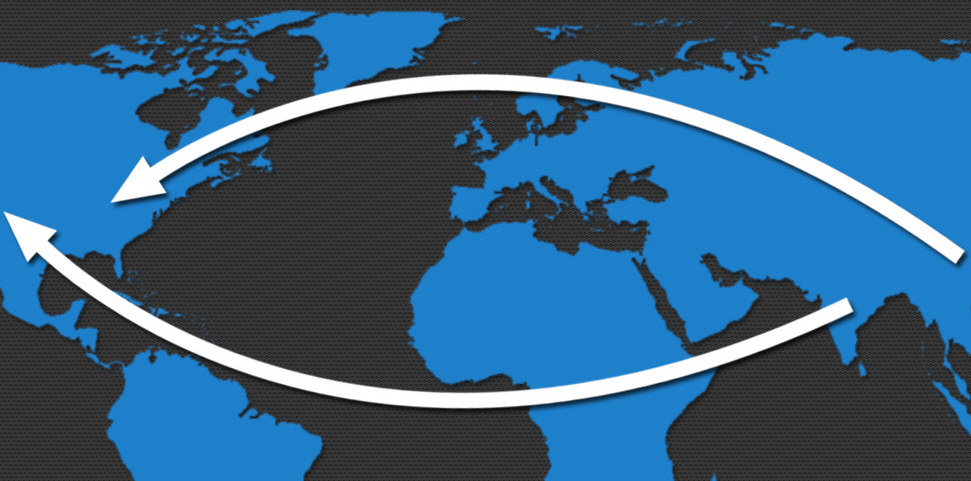
The Benefits of Reshoring ERP
The following infographic demonstrates at a glance the reasons why reshoring delivers on this claim and explores the risks and dangers of offshoring the ERP models.
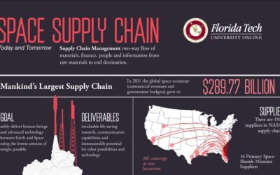
Space Supply Chain Management
Supply chain management is used in almost every business model, even when it comes to Space travel. In 2011, the global space economy grew to to almost $3 billion! Check out the infographic below presented by Florida Tech University Online, your source for Supply Chain Management Degree Programs Online, to learn more about space supply chain management.

The Student Experience Online
In the past 10 years, and even more recently, Higher Education Industry has changed drastically, and it’s changed at hyperspeed with much of the change coming from technology. MOOC’s (Massive Open Online Courses) 100% online institutions have made kids think about brick and mortar institutions in a new light.
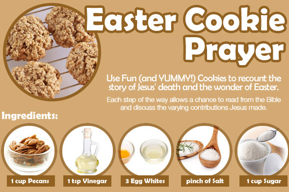
Easter Cookie Prayer
The following infographic from Christianity Cove uses an Easter Bible snack as a way to discover the wonder of Easter, using cookies to recount the story of Jesus’ death and resurrection. Each step of the way allows a chance to read from the Bible and discuss the varying contributions Jesus made.
The Interested Traveller: A Guide To Hotel History
Hotels haven’t always been the comfortable retreats they are today. Back in the Middle Ages, you’d have been more likely to find yourself crashing out on the alehouse floor with a blanket rather than ordering room service to a penthouse suite. Times have clearly changed, so following on from our Hungry Traveller infographic series from Hotels4U.com, here’s something for the history buffs among you.
A Century of Car Safety
From the Ford Model T to the well-oiled machines of today, the automobile has an illustrious history of evolution and reinvention. What was once a relatively slow-moving death machine has now become a lightning-fast safety bubble. Confused.com takes you on the journey of car safety’s evolution.
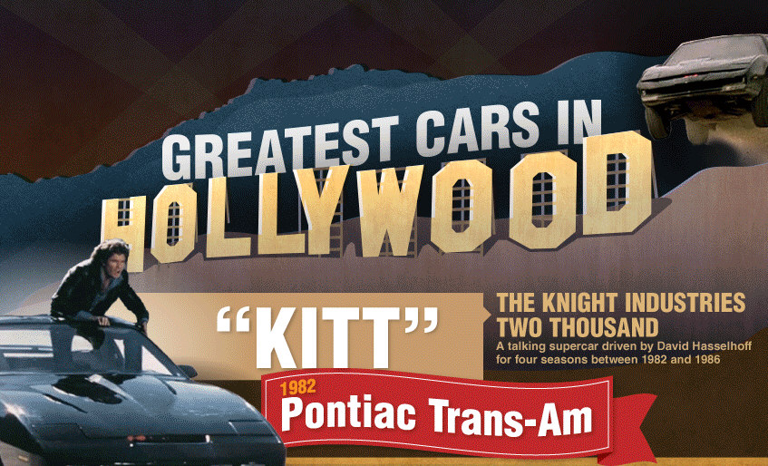
The Greatest Cars in Hollywood History
Nothing’s better than a great movie car chase. Most of us that have been around for awhile recall Steve McQueen navigating the streets of San Francisco in that 1968 Mustang GT 390 in Bullitt. Many call it the greatest movie car chase ever, and the vehicles in it were pretty close to what you could buy off the lot at the time. Sometimes, however, heroes need a little something “extra” from their movie or television cars.
Florida’s Top Attractions
This infographic by Direct Villas Florida provides information about the top 10 Florida attractions. It also gives statistics about each of the attractions including the number of visitors they get each year, the amount of land they take up and the year they were created.
School Violence in the USA
School violence is youth violence that occurs on school property, which can occur on the way to or from school or at school-sponsored event. Want to know trends that contribute to school violence, what are various risk factors, and how it can be prevented? This infographic from Test Score Breakthrough lists important points through visually rich graphics.
Spaying and Neutering: The Choice of the Responsible Pet Owner
If you do not neuter your male dog, he might give into his roaming instincts and travel far from home. Turn to this infographic to learn more about why you should spay or neuter your pet.
The Benefits of Reshoring ERP
The following infographic demonstrates at a glance the reasons why reshoring delivers on this claim and explores the risks and dangers of offshoring the ERP models.
Space Supply Chain Management
Supply chain management is used in almost every business model, even when it comes to Space travel. In 2011, the global space economy grew to to almost $3 billion! Check out the infographic below presented by Florida Tech University Online, your source for Supply Chain Management Degree Programs Online, to learn more about space supply chain management.
The Student Experience Online
In the past 10 years, and even more recently, Higher Education Industry has changed drastically, and it’s changed at hyperspeed with much of the change coming from technology. MOOC’s (Massive Open Online Courses) 100% online institutions have made kids think about brick and mortar institutions in a new light.
Easter Cookie Prayer
The following infographic from Christianity Cove uses an Easter Bible snack as a way to discover the wonder of Easter, using cookies to recount the story of Jesus’ death and resurrection. Each step of the way allows a chance to read from the Bible and discuss the varying contributions Jesus made.
The Interested Traveller: A Guide To Hotel History
Hotels haven’t always been the comfortable retreats they are today. Back in the Middle Ages, you’d have been more likely to find yourself crashing out on the alehouse floor with a blanket rather than ordering room service to a penthouse suite. Times have clearly changed, so following on from our Hungry Traveller infographic series from Hotels4U.com, here’s something for the history buffs among you.
A Century of Car Safety
From the Ford Model T to the well-oiled machines of today, the automobile has an illustrious history of evolution and reinvention. What was once a relatively slow-moving death machine has now become a lightning-fast safety bubble. Confused.com takes you on the journey of car safety’s evolution.
The Greatest Cars in Hollywood History
Nothing’s better than a great movie car chase. Most of us that have been around for awhile recall Steve McQueen navigating the streets of San Francisco in that 1968 Mustang GT 390 in Bullitt. Many call it the greatest movie car chase ever, and the vehicles in it were pretty close to what you could buy off the lot at the time. Sometimes, however, heroes need a little something “extra” from their movie or television cars.
Partners


Browse Archives By Category
Animated Infographics
Business Infographics
Career & Jobs Infographics
Education Infographics
Entertainment Industry Infographics
Environmental Infographics
Finance & Money Infographics
Food & Drink Infographics
Health Infographics
Historical Infographics
Home & Garden Infographics
Internet Infographics
Law and Legal Infographics
Lifestyle Infographics
Marketing Infographics
Offbeat Infographics
Parenting Infographics
Pets & Animals Infographics
Political Infographics
Shopping Infographics
Sports and Athletic Infographics
Technology Infographics
Transportation Infographics
Travel Infographics
Video Infographics