





Search 12,100+ Infographics!
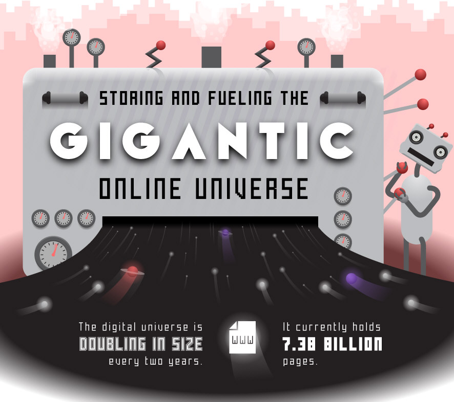
Storing and Fueling the Gigantic Online Universe
The digital universe is doubling in size every two years. It currently hold 7.38 billion pages. Where is it all stored? Find out in the following infographic.
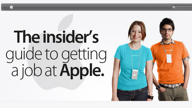
The Insider’s Guide to Getting a Job at Apple
Whether it’s a job designing the world’s next game-changing device or it’s a job selling Macs and iPads, working for Apple has its perks. Do you have what it takes? Find out in this infographic.
The Human Side of Healthcare
Believe it or not, every business has a human side to it, even healthcare. This infographic presented by Healthcare-Administration-Degree.net takes a look at how healthcare professionals show their human side with patients. Check it out below to learn more about the human side of healthcare.
The Reign of Email
In case you haven’t heard it enough — email isn’t dead. Not only was email the most popular online activity of 2012, but it also has higher click-through rates, conversion rates and ROI than other channels. And this trend is only going to continue — 56% of marketers plan to increase their email marketing budgets this year, which makes email the leading source of marketing investments.

Things You Should Know About Olive Oil
At first glance, olive oil, a staple product found in many kitchens, seems to be a simple and well known item. After all, it has been around for thousands of years and its benefits have been touted by generations of farmers and companies big and small. Recently, however, the bland business of olive oil has taken on a new shine. Scientific analysis is confirming centuries of experience and explaining why olive oil, and especially extra virgin olive oil is so good for the human body.
Perceptions of Permission in Marketing
Perceptions of Permission in marketing is becoming an increasingly important topic as filters become stronger and easier to use, and government continues to regulate. The infographic shows the results from over 1,000 consumers and marketers on their feelings about Permission.
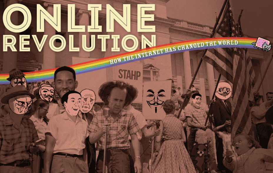
Online Revolution: How the Internet Has Changed the World
The Internet has provided us with much entertainment over the years. It has also had a pretty big impact on our lifestyles and the world around us. This infographic takes a look at the online evolution and the different ways the Internet has changed the world.
Home Decor Trends for 2013
Colors create the mood and style of your home, whether casual, elegant, modern, classic or eclectic. Color is only one home decorating trend that changes each season and we want to keep your home in vogue for 2013. These new home decor trends for 2013 can complement your unique style as this infographic from Blindsgalore.com simply illustrates.
The Germy Truth About Influenza
Did you catch the flu this season? Or are you still hoping you won’t succumb to this illness? Whether you have an immune system of steel or you unfortunately caught the flu bug, read on to learn the germy truth of the influenza virus in this infographic. Now go wash your hands!
Technology of Plumbing: Then and Now
Did you know that the first flush toilet was invented in 1596 by Sir John Harrington? There have been many advancements in plumbing throughout the years. Check out the infographic below to learn about how plumbing technology has evolved.
Storing and Fueling the Gigantic Online Universe
The digital universe is doubling in size every two years. It currently hold 7.38 billion pages. Where is it all stored? Find out in the following infographic.
The Insider’s Guide to Getting a Job at Apple
Whether it’s a job designing the world’s next game-changing device or it’s a job selling Macs and iPads, working for Apple has its perks. Do you have what it takes? Find out in this infographic.
The Human Side of Healthcare
Believe it or not, every business has a human side to it, even healthcare. This infographic presented by Healthcare-Administration-Degree.net takes a look at how healthcare professionals show their human side with patients. Check it out below to learn more about the human side of healthcare.
The Reign of Email
In case you haven’t heard it enough — email isn’t dead. Not only was email the most popular online activity of 2012, but it also has higher click-through rates, conversion rates and ROI than other channels. And this trend is only going to continue — 56% of marketers plan to increase their email marketing budgets this year, which makes email the leading source of marketing investments.
Things You Should Know About Olive Oil
At first glance, olive oil, a staple product found in many kitchens, seems to be a simple and well known item. After all, it has been around for thousands of years and its benefits have been touted by generations of farmers and companies big and small. Recently, however, the bland business of olive oil has taken on a new shine. Scientific analysis is confirming centuries of experience and explaining why olive oil, and especially extra virgin olive oil is so good for the human body.
Perceptions of Permission in Marketing
Perceptions of Permission in marketing is becoming an increasingly important topic as filters become stronger and easier to use, and government continues to regulate. The infographic shows the results from over 1,000 consumers and marketers on their feelings about Permission.
Online Revolution: How the Internet Has Changed the World
The Internet has provided us with much entertainment over the years. It has also had a pretty big impact on our lifestyles and the world around us. This infographic takes a look at the online evolution and the different ways the Internet has changed the world.
Home Decor Trends for 2013
Colors create the mood and style of your home, whether casual, elegant, modern, classic or eclectic. Color is only one home decorating trend that changes each season and we want to keep your home in vogue for 2013. These new home decor trends for 2013 can complement your unique style as this infographic from Blindsgalore.com simply illustrates.
The Germy Truth About Influenza
Did you catch the flu this season? Or are you still hoping you won’t succumb to this illness? Whether you have an immune system of steel or you unfortunately caught the flu bug, read on to learn the germy truth of the influenza virus in this infographic. Now go wash your hands!
Technology of Plumbing: Then and Now
Did you know that the first flush toilet was invented in 1596 by Sir John Harrington? There have been many advancements in plumbing throughout the years. Check out the infographic below to learn about how plumbing technology has evolved.
Partners






Browse Archives By Category
Animated Infographics
Business Infographics
Career & Jobs Infographics
Education Infographics
Entertainment Industry Infographics
Environmental Infographics
Finance & Money Infographics
Food & Drink Infographics
Health Infographics
Historical Infographics
Home & Garden Infographics
Internet Infographics
Law and Legal Infographics
Lifestyle Infographics
Marketing Infographics
Offbeat Infographics
Parenting Infographics
Pets & Animals Infographics
Political Infographics
Shopping Infographics
Sports and Athletic Infographics
Technology Infographics
Transportation Infographics
Travel Infographics
Video Infographics