


Search 12,100+ Infographics!
Christmas Travel Trends: Surf Beats Snow in 2012
ave you spent the past six twelve months dreaming of a white Christmas? If you’re like 72% of travelers who planned their December vacations on FlipKey, then chances are that you’re imagining white-sand beaches and colorful bathing suits, not frosted pine trees and ugly sweaters. While chilly northern cities like New York, Paris, and Breckenridge stand out as top destinations this season, most travelers are heading to the tropics for the holidays.
Gangnam Style: The Social Media Impact of a Viral Video
What do nearly a billion viral YouTube views REALLY mean? In this Gangnam Style infographic, take a look at the impact of Gangnam Style across all of Psy’s channels to see how a video view stacks up against the other major social media currencies.
Hawaiian Fashion Through the Ages
Luaus, coconuts and pineapples are all things that come to mind when you think of Hawaii. Part of what makes Hawaii a great travel destination, as well as a place to live, is its own unique culture. Part of that culture is the Hawaiian clothing, which happens to have its own history. Hawaiian wear is shaped by the climate in Hawaii. Living and traveling in this climate can be a welcomed change from cold, dark, dreary days and tons of snow.
Do Financial Challenges Cause Divorce?
Financial challenges and arguments are one of the biggest contributors to divorce. No surprise there. But is there a happy medium for marital finances? Yes and no, financial and relationship experts say. Learn more in the following infographic.
Tweeting On The John
Have you ever taken your smartphone to the restroom and tweeted while you were doing your “business”? Well if you have, don’t feel bad, you aren’t the only one. This infographic highlights people’s social media use while on the John.
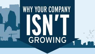
Why Your Company Isn’t Growing
At the “When Growth Stalls” website, the online location for Steve McKee’s book, there is an anonymous self-diagnosis survey that encourages individual business executives to review how their company is doing. McKee Wallwork Cleveland garnered over 1,000 responses from these business professionals and recently analyzed the results. The results are astounding.

Do Your Applicants Belong on the Naughty or Nice List?
It can be difficult to find the right people for your company’s open jobs. How will you know if the candidate is top talent or could be the office Grinch? The infographic below, compiled by Spark Hire, an online video resume and interviewing platform, provides a helpful quiz to let you know if your holiday candidate is a gift or a curse.
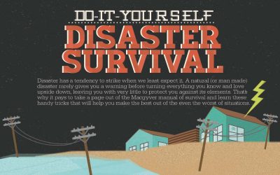
DIY Disaster Survival
Disaster has a tendency to strike when we least expect it. A natural (or man made) disaster rarely gives you a warning before turning everything you know and love upside down, leaving you with very little to protect you against its elements. That’s why it pays to take a page out of the Macgyver manual of survival and learn these handy tricks that will help you make the best out of the even the worst of situations.
Unintentional Injury Deaths
In 2010, 118,043 people died as a result of an unintentional injury, making it the 5th leading cause of death in the United States. Get the facts and learn how you can protect yourself from personal injury in the following infographic from Total Injury.
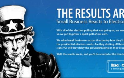
Small Business Reacts to 2012 Election Results
Cargo asked small businesses across the country how they’d be impacted by the presidential election results. Are they dusting off those “Help Wanted” signs? Or will they delay the groundbreaking on their second location? Well, the results are in, and you’ll be amazed at the trends that were discovered.
Christmas Travel Trends: Surf Beats Snow in 2012
ave you spent the past six twelve months dreaming of a white Christmas? If you’re like 72% of travelers who planned their December vacations on FlipKey, then chances are that you’re imagining white-sand beaches and colorful bathing suits, not frosted pine trees and ugly sweaters. While chilly northern cities like New York, Paris, and Breckenridge stand out as top destinations this season, most travelers are heading to the tropics for the holidays.
Gangnam Style: The Social Media Impact of a Viral Video
What do nearly a billion viral YouTube views REALLY mean? In this Gangnam Style infographic, take a look at the impact of Gangnam Style across all of Psy’s channels to see how a video view stacks up against the other major social media currencies.
Hawaiian Fashion Through the Ages
Luaus, coconuts and pineapples are all things that come to mind when you think of Hawaii. Part of what makes Hawaii a great travel destination, as well as a place to live, is its own unique culture. Part of that culture is the Hawaiian clothing, which happens to have its own history. Hawaiian wear is shaped by the climate in Hawaii. Living and traveling in this climate can be a welcomed change from cold, dark, dreary days and tons of snow.
Do Financial Challenges Cause Divorce?
Financial challenges and arguments are one of the biggest contributors to divorce. No surprise there. But is there a happy medium for marital finances? Yes and no, financial and relationship experts say. Learn more in the following infographic.
Tweeting On The John
Have you ever taken your smartphone to the restroom and tweeted while you were doing your “business”? Well if you have, don’t feel bad, you aren’t the only one. This infographic highlights people’s social media use while on the John.
Why Your Company Isn’t Growing
At the “When Growth Stalls” website, the online location for Steve McKee’s book, there is an anonymous self-diagnosis survey that encourages individual business executives to review how their company is doing. McKee Wallwork Cleveland garnered over 1,000 responses from these business professionals and recently analyzed the results. The results are astounding.
Do Your Applicants Belong on the Naughty or Nice List?
It can be difficult to find the right people for your company’s open jobs. How will you know if the candidate is top talent or could be the office Grinch? The infographic below, compiled by Spark Hire, an online video resume and interviewing platform, provides a helpful quiz to let you know if your holiday candidate is a gift or a curse.
DIY Disaster Survival
Disaster has a tendency to strike when we least expect it. A natural (or man made) disaster rarely gives you a warning before turning everything you know and love upside down, leaving you with very little to protect you against its elements. That’s why it pays to take a page out of the Macgyver manual of survival and learn these handy tricks that will help you make the best out of the even the worst of situations.
Unintentional Injury Deaths
In 2010, 118,043 people died as a result of an unintentional injury, making it the 5th leading cause of death in the United States. Get the facts and learn how you can protect yourself from personal injury in the following infographic from Total Injury.
Small Business Reacts to 2012 Election Results
Cargo asked small businesses across the country how they’d be impacted by the presidential election results. Are they dusting off those “Help Wanted” signs? Or will they delay the groundbreaking on their second location? Well, the results are in, and you’ll be amazed at the trends that were discovered.
Partners


Browse Archives By Category
Animated Infographics
Business Infographics
Career & Jobs Infographics
Education Infographics
Entertainment Industry Infographics
Environmental Infographics
Finance & Money Infographics
Food & Drink Infographics
Health Infographics
Historical Infographics
Home & Garden Infographics
Internet Infographics
Law and Legal Infographics
Lifestyle Infographics
Marketing Infographics
Offbeat Infographics
Parenting Infographics
Pets & Animals Infographics
Political Infographics
Shopping Infographics
Sports and Athletic Infographics
Technology Infographics
Transportation Infographics
Travel Infographics
Video Infographics