





Search 12,100+ Infographics!
Pit Bulls: Myths vs. Facts
Pit bull ownership has been a hotly debated topic in recent years. The pit bull, at one time bred for fighting, has consequently become notorious for vicious attacks, thus encouraging many cities and counties to elect and enforce breed-specific legislation (BSL) that essentially bans pit bulls.
Revealing Relationship Between Homeownership and Household Income
There are a lot of factors that impact the rate at which Americans own homes – especially household income. Often, the rise or fall of household income has much to do with how many Americans can afford to own homes. Throw in inflation and interest rates and it is easy to see what factors were involved with the decline of home ownership rates since 2004 and the housing market collapse in 2007.
Fundamentals in Web Design Transformation
Web design covers many different skills and disciplines which are used in the creating and maintaining of the websites. Web graphic design, authoring, interface design, inclusion of standardized code and proprietary software, SEO and user experience design are the different areas of web design as you will see in this infographic.

A Snapshot of Entrepreneurship Today
What is the state of entrepreneurship these days? There seems to be a lot of confusion regarding how people are starting their own businesses and if these new ventures are surviving. With all the inflated and often contradictory information going around, The Frugal Entrepreneur has decided to do some research in order to get a true snap shot of entrepreneurial activity today.

How To Outsource And Win Big
The following is an interesting infographic on how outsourcing is saving not only online time for companies but very valuable time. This infographic takes you through the low risk, high reward journey of outsourcing your SEO.
Malware is Everywhere!
Over the years, malware has become a serious problem for organizations and individuals alike. While most people assume only large businesses are targeted by malware attacks, it’s still a threat for small and medium size businesses, as well
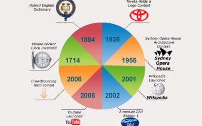
History of Design Crowdsourcing
When jobs and tasks are outsourced to a distributed group of people it’s called as crowd sourcing. Crowd sourcing is cheaper and it results in a greater number of solutions for a problem as the problem or the task is opened up to a large group from whom solutions and results are obtained. This infographic takes a look at the history of design crowd sourcing.
3 Auto Insurance Fraud Scenarios – What Every Person Should Know
There are many ways that you can become a victim of organized insurance fraud. It can result in huge insurance claim costs paid by your insurer and consequently, your premiums going up. Or, it could be even worse – you could be injured during an auto fraud accident! This infographic from InsurEye demonstrates the 3 most frequent auto insurance fraud scenarios to help Canadians to recognize and avoid them.
How Hack-Friendly Is Your Password?
Maintaining your internet security is imperative in today’s digital era. Over 8 million Americans were victims of identity theft in 2011. In this infographic, Lifelock looks at passwords and how hack-friendly (or not) your particular password might be.

What Happens to the Graduates You Hire?
The following infographic reveals what happens to graduates you hire and helps us to better understand why graduates are likely to stay in an organization and become future leaders. The infographic is the result of a conducted survey of 2800+ graduates who had completed psychometric tests in the past decade.
Pit Bulls: Myths vs. Facts
Pit bull ownership has been a hotly debated topic in recent years. The pit bull, at one time bred for fighting, has consequently become notorious for vicious attacks, thus encouraging many cities and counties to elect and enforce breed-specific legislation (BSL) that essentially bans pit bulls.
Revealing Relationship Between Homeownership and Household Income
There are a lot of factors that impact the rate at which Americans own homes – especially household income. Often, the rise or fall of household income has much to do with how many Americans can afford to own homes. Throw in inflation and interest rates and it is easy to see what factors were involved with the decline of home ownership rates since 2004 and the housing market collapse in 2007.
Fundamentals in Web Design Transformation
Web design covers many different skills and disciplines which are used in the creating and maintaining of the websites. Web graphic design, authoring, interface design, inclusion of standardized code and proprietary software, SEO and user experience design are the different areas of web design as you will see in this infographic.
A Snapshot of Entrepreneurship Today
What is the state of entrepreneurship these days? There seems to be a lot of confusion regarding how people are starting their own businesses and if these new ventures are surviving. With all the inflated and often contradictory information going around, The Frugal Entrepreneur has decided to do some research in order to get a true snap shot of entrepreneurial activity today.
How To Outsource And Win Big
The following is an interesting infographic on how outsourcing is saving not only online time for companies but very valuable time. This infographic takes you through the low risk, high reward journey of outsourcing your SEO.
Malware is Everywhere!
Over the years, malware has become a serious problem for organizations and individuals alike. While most people assume only large businesses are targeted by malware attacks, it’s still a threat for small and medium size businesses, as well
History of Design Crowdsourcing
When jobs and tasks are outsourced to a distributed group of people it’s called as crowd sourcing. Crowd sourcing is cheaper and it results in a greater number of solutions for a problem as the problem or the task is opened up to a large group from whom solutions and results are obtained. This infographic takes a look at the history of design crowd sourcing.
3 Auto Insurance Fraud Scenarios – What Every Person Should Know
There are many ways that you can become a victim of organized insurance fraud. It can result in huge insurance claim costs paid by your insurer and consequently, your premiums going up. Or, it could be even worse – you could be injured during an auto fraud accident! This infographic from InsurEye demonstrates the 3 most frequent auto insurance fraud scenarios to help Canadians to recognize and avoid them.
How Hack-Friendly Is Your Password?
Maintaining your internet security is imperative in today’s digital era. Over 8 million Americans were victims of identity theft in 2011. In this infographic, Lifelock looks at passwords and how hack-friendly (or not) your particular password might be.
What Happens to the Graduates You Hire?
The following infographic reveals what happens to graduates you hire and helps us to better understand why graduates are likely to stay in an organization and become future leaders. The infographic is the result of a conducted survey of 2800+ graduates who had completed psychometric tests in the past decade.
Partners






Browse Archives By Category
Animated Infographics
Business Infographics
Career & Jobs Infographics
Education Infographics
Entertainment Industry Infographics
Environmental Infographics
Finance & Money Infographics
Food & Drink Infographics
Health Infographics
Historical Infographics
Home & Garden Infographics
Internet Infographics
Law and Legal Infographics
Lifestyle Infographics
Marketing Infographics
Offbeat Infographics
Parenting Infographics
Pets & Animals Infographics
Political Infographics
Shopping Infographics
Sports and Athletic Infographics
Technology Infographics
Transportation Infographics
Travel Infographics
Video Infographics