


Search 12,100+ Infographics!
Cost of a Road Trip to the Top 10 U.S. Vacation Cities
I DRIVE SAFELY breaks down the cost of a 25-day road trip to the top 10 U.S. vacation cities including the price of gas, food and lodging. This infographic also includes tips for saving money while on each trip.
The Anatomy of Saving and Spending
Mixing psychology, neuroscience and consumer analysis – this infographic investigates whether there’s more to our spending and saving habits than just personal preference, and provides tips about how to manage the financial inclinations that are hardwired into our brains.
English Language Facts
English language has become a global means of communication. It is not only the most widely written (counting scientific articles, periodical and the impressing fact that it is a common language of the Internet), it’s also spoken throughout different international conversations, no matter whether they are official or business meetings.
Flintoff on Fashion
This infographic by Jacamo graphically presents research into mens’ fashion habits and has managed to uncover some interesting statistics in the process.
Your Dirty Habits Make Me Sick
If you really think about, we can all be kind of gross. A lot of people admit to not washing their hands after using the restroom, among many other dirty habits. This infographic presented by ionSwipes highlights some dirty habits as well as some alarming stats. Check it out below to learn more.
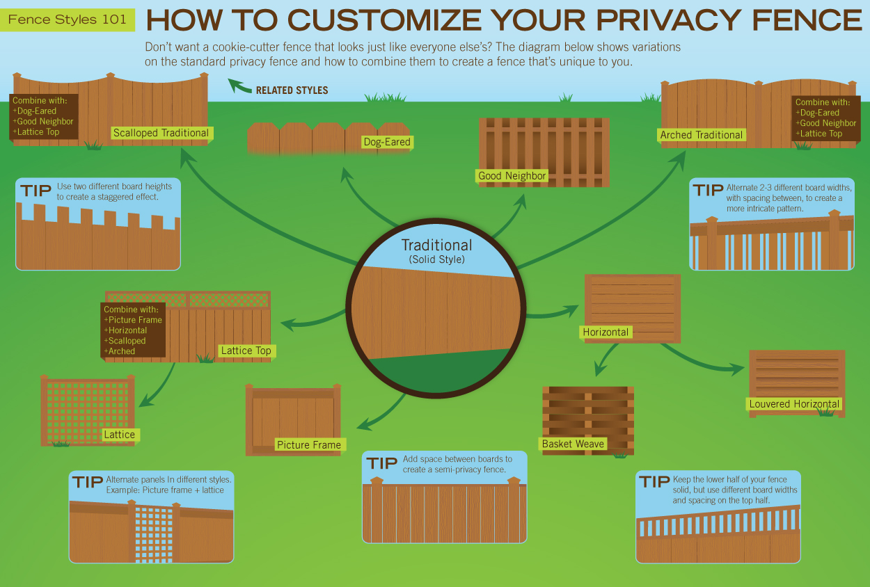
How to Customize Your Privacy Fence
To encourage more creativity in fence design, Rick’s Custom Fencing & Decking has created the following chart, which showcases out some of the ways you can customize a wood fence.
The Super-Charged Story of Marijuana
The following infographic releases a timeline of the history of Marijuana in the United States based on the book, Super-Charged: How Outlaws, Hippies, and Scientists Reinvented Marijuana by Jim Rendon.
Baconomy: The Art of Bacon Barter
As part of a strategic marketing plan by Oscar Mayer, Josh has taken on the task of bacon barterer. With only 3,000 pounds of bacon to barter with Josh hopes to make it all the way to L.A. from New York, and he has done pretty well so far. Check out this infographic presented by paydayloan.co.uk to find out more about the bacon barter.
Things To Do in Hawaii
Learn why Hawaii is one of the most popular tourist locations in the world in the following infographic published by Expedia. See what selection of activities are available for you at your fingertips the next time you travel to paradise.
The Small Business Landscape
Small businesses make up 80% of the total number of businesses in the U.S. today. And for their owners, today’s economic environment presents a unique set of challenges and opportunities to build their business. Signs.com explores some of the pitfalls, plans and perspectives of current business owners to get an idea of how they succeed.
Cost of a Road Trip to the Top 10 U.S. Vacation Cities
I DRIVE SAFELY breaks down the cost of a 25-day road trip to the top 10 U.S. vacation cities including the price of gas, food and lodging. This infographic also includes tips for saving money while on each trip.
The Anatomy of Saving and Spending
Mixing psychology, neuroscience and consumer analysis – this infographic investigates whether there’s more to our spending and saving habits than just personal preference, and provides tips about how to manage the financial inclinations that are hardwired into our brains.
English Language Facts
English language has become a global means of communication. It is not only the most widely written (counting scientific articles, periodical and the impressing fact that it is a common language of the Internet), it’s also spoken throughout different international conversations, no matter whether they are official or business meetings.
Flintoff on Fashion
This infographic by Jacamo graphically presents research into mens’ fashion habits and has managed to uncover some interesting statistics in the process.
Your Dirty Habits Make Me Sick
If you really think about, we can all be kind of gross. A lot of people admit to not washing their hands after using the restroom, among many other dirty habits. This infographic presented by ionSwipes highlights some dirty habits as well as some alarming stats. Check it out below to learn more.
How to Customize Your Privacy Fence
To encourage more creativity in fence design, Rick’s Custom Fencing & Decking has created the following chart, which showcases out some of the ways you can customize a wood fence.
The Super-Charged Story of Marijuana
The following infographic releases a timeline of the history of Marijuana in the United States based on the book, Super-Charged: How Outlaws, Hippies, and Scientists Reinvented Marijuana by Jim Rendon.
Baconomy: The Art of Bacon Barter
As part of a strategic marketing plan by Oscar Mayer, Josh has taken on the task of bacon barterer. With only 3,000 pounds of bacon to barter with Josh hopes to make it all the way to L.A. from New York, and he has done pretty well so far. Check out this infographic presented by paydayloan.co.uk to find out more about the bacon barter.
Things To Do in Hawaii
Learn why Hawaii is one of the most popular tourist locations in the world in the following infographic published by Expedia. See what selection of activities are available for you at your fingertips the next time you travel to paradise.
The Small Business Landscape
Small businesses make up 80% of the total number of businesses in the U.S. today. And for their owners, today’s economic environment presents a unique set of challenges and opportunities to build their business. Signs.com explores some of the pitfalls, plans and perspectives of current business owners to get an idea of how they succeed.
Partners


Browse Archives By Category
Animated Infographics
Business Infographics
Career & Jobs Infographics
Education Infographics
Entertainment Industry Infographics
Environmental Infographics
Finance & Money Infographics
Food & Drink Infographics
Health Infographics
Historical Infographics
Home & Garden Infographics
Internet Infographics
Law and Legal Infographics
Lifestyle Infographics
Marketing Infographics
Offbeat Infographics
Parenting Infographics
Pets & Animals Infographics
Political Infographics
Shopping Infographics
Sports and Athletic Infographics
Technology Infographics
Transportation Infographics
Travel Infographics
Video Infographics