





Search 12,100+ Infographics!
Alcohol Facts
Alcohol is a widely abused substance. According to the National Survey on Drug Use and Health in 2010, 15.0 million people abused or had a dependence on alcohol. Many people are addicted to alcohol; however, the amount of people that actually receive treatment for alcoholism is not high. The following infographic presents some interesting facts on alcohol.
Epic Battle of Graphic Design Software
Quite often we see newbie and amateur graphic designers using Adobe software for a variety of projects without the slightest idea about the strengths and weaknesses of each tool. While Photoshop, Illustrator and InDesign are amazing tools, designers need to be aware of the application of each tool before applying them for specific purposes.
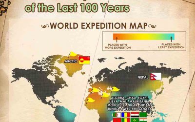
The Greatest Explorers of the Last 100 Years
From the biggest names in worldwide exploration to their most amazing achievements – and everything in between – an OutdoorWorldDirect.co.uk infographic celebrates The Greatest Explorers of the Last 100 Years. This beautifully created infographic reveals a host of fascinating facts and details about worldwide exploration in a powerful and easy-to-understand on-line resource.

Sensible Tweet Chat Checklist for Businesses
Hosting a Tweet Chat shows thought leadership in your industry, can drive traffic to your website, promote your overall marketing message, and help you engage directly with your customer base. Follow the following checklist by The Whole Brain Group to create one for your business!
Shoplifting and Employee Theft in America
Every year, Jack L. Hayes International conducts a survey with 24 retail stores (with over 18,000 stores and over $589,000,000 in sales) about employee theft and shoplifting. This infographic by 2MCCTV talks about these unbelievable stats. Like in 2011 alone, they stole over 6 billion dollars, but only $161 million was recovered.
Valuation: The Essence of Corporate Finance
Valuation is the essence of Corporate Finance. As managers a key objective should be to maximize shareholder value. Without a good way to measure value, decision making is not objective! Valuation is what can guide management to be objective in decision making. This infographic is the first of an info-graphic series on corporate finance.
Blood Pressure: Know Your Numbers
This infographic by Westfield Health provides some useful tips and advice about how you can keep your blood pressure in check. High blood pressure is one of the most common causes of heart attacks and strokes, and is also a risk factor for heart disease, kidney disease and dementia.
How To Optimize Your PPC Campaigns
Pay per click (PPC) is an Internet advertising model used to direct traffic to websites where advertisers pay the publisher (typically a website owner) when the ad is clicked. Check out the infographic for effective tips to optimize your PPC campaigns including selecting an advertising platform, doing proper keyword research, testing different ad copies, optimizing landing pages and lot more.
It’s Alive! The Social Media Monster
We all, at one point or another, have fallen into the social media trap; telling ourselves we are only going to look at something for a minute, and then an hour goes by. Now, when you are at home, this may not be that big of a deal, but at work, it’s a big no-no. The infographic below presented by RedeApp illustrates how social media can put a major damper on business productivity.
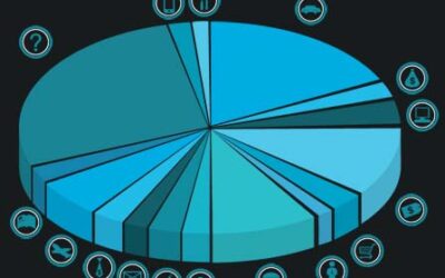
How Small Businesses Are Spending Their Money
See how your small business expenses compare to the national average. In the infographic by Shoeboxed, see data from 12,000+ small businesses showing small business insurance costs are up 25% in 2012 and utilities have doubled.
Alcohol Facts
Alcohol is a widely abused substance. According to the National Survey on Drug Use and Health in 2010, 15.0 million people abused or had a dependence on alcohol. Many people are addicted to alcohol; however, the amount of people that actually receive treatment for alcoholism is not high. The following infographic presents some interesting facts on alcohol.
Epic Battle of Graphic Design Software
Quite often we see newbie and amateur graphic designers using Adobe software for a variety of projects without the slightest idea about the strengths and weaknesses of each tool. While Photoshop, Illustrator and InDesign are amazing tools, designers need to be aware of the application of each tool before applying them for specific purposes.
The Greatest Explorers of the Last 100 Years
From the biggest names in worldwide exploration to their most amazing achievements – and everything in between – an OutdoorWorldDirect.co.uk infographic celebrates The Greatest Explorers of the Last 100 Years. This beautifully created infographic reveals a host of fascinating facts and details about worldwide exploration in a powerful and easy-to-understand on-line resource.
Sensible Tweet Chat Checklist for Businesses
Hosting a Tweet Chat shows thought leadership in your industry, can drive traffic to your website, promote your overall marketing message, and help you engage directly with your customer base. Follow the following checklist by The Whole Brain Group to create one for your business!
Shoplifting and Employee Theft in America
Every year, Jack L. Hayes International conducts a survey with 24 retail stores (with over 18,000 stores and over $589,000,000 in sales) about employee theft and shoplifting. This infographic by 2MCCTV talks about these unbelievable stats. Like in 2011 alone, they stole over 6 billion dollars, but only $161 million was recovered.
Valuation: The Essence of Corporate Finance
Valuation is the essence of Corporate Finance. As managers a key objective should be to maximize shareholder value. Without a good way to measure value, decision making is not objective! Valuation is what can guide management to be objective in decision making. This infographic is the first of an info-graphic series on corporate finance.
Blood Pressure: Know Your Numbers
This infographic by Westfield Health provides some useful tips and advice about how you can keep your blood pressure in check. High blood pressure is one of the most common causes of heart attacks and strokes, and is also a risk factor for heart disease, kidney disease and dementia.
How To Optimize Your PPC Campaigns
Pay per click (PPC) is an Internet advertising model used to direct traffic to websites where advertisers pay the publisher (typically a website owner) when the ad is clicked. Check out the infographic for effective tips to optimize your PPC campaigns including selecting an advertising platform, doing proper keyword research, testing different ad copies, optimizing landing pages and lot more.
It’s Alive! The Social Media Monster
We all, at one point or another, have fallen into the social media trap; telling ourselves we are only going to look at something for a minute, and then an hour goes by. Now, when you are at home, this may not be that big of a deal, but at work, it’s a big no-no. The infographic below presented by RedeApp illustrates how social media can put a major damper on business productivity.
How Small Businesses Are Spending Their Money
See how your small business expenses compare to the national average. In the infographic by Shoeboxed, see data from 12,000+ small businesses showing small business insurance costs are up 25% in 2012 and utilities have doubled.
Partners






Browse Archives By Category
Animated Infographics
Business Infographics
Career & Jobs Infographics
Education Infographics
Entertainment Industry Infographics
Environmental Infographics
Finance & Money Infographics
Food & Drink Infographics
Health Infographics
Historical Infographics
Home & Garden Infographics
Internet Infographics
Law and Legal Infographics
Lifestyle Infographics
Marketing Infographics
Offbeat Infographics
Parenting Infographics
Pets & Animals Infographics
Political Infographics
Shopping Infographics
Sports and Athletic Infographics
Technology Infographics
Transportation Infographics
Travel Infographics
Video Infographics