





Search 12,100+ Infographics!
The Benefits of Using Digital Menus
Soon all restaurants will have to comply with the new labeling laws coming down the pipe. As many as 200,000 restaurants are scrambling to get ready for this laws. All those restaurants will have to comply by adding the nutritional information. The is long and...
Father’s Day vs Mother’s Day
When it comes to receiving gifts, fathers get the short end of the stick. In June, a simple BBQ and necktie will suffice while in May, gold and diamonds handed out over fancy dinners is the norm.In this infographic from Mrs. Fields, the two holidays are explored and compared.
Dine and Dish: Are Social Media and Food the Perfect Pairing?
Currently, 49 percent — or nearly half — of surveyed consumers learn about food through social networks, and 9 percent have downloaded a mobile food app in the past year. From tweeting about the delectable belgian waffle they just ate and discovering recipes on image-centric cooking blogs to checking into the hottest new restaurants, more food-obsessed Americans are turning to social technology to help satiate their cravings.

The College Try: How To Pick The Right School
Picking a college is never an easy decision. For most students, the choice is not simply a matter of where to spend the next four years, but more importantly, the institution their names will be attached to for a lifetime. With so much at stake, it pays to look at the big picture instead of deciding impulsively.
Google Penguin Fever: The Recovery
Countless numbers of website have been recently hit by the Google Penguin update. For many, the “Penguin recovery process” is something they must now thing about. There are several options for Penguin recovery and the following infographic by Submitinme.com may help.
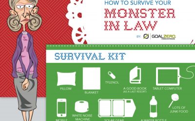
How to Survive Your Monster-In-Law
Now I actually love my mother(monster)-in-law. We get along great. It’s her sister that I can’t stand. That being said, there are plenty of guys and gals that cannot stand their mother-in-laws and dread the thought of a visit. This infographic provides some tips on how to survive your next encounter with the “monster-in-law.”
Mobile Apps Download Trends
Mobile app downloads have become immensely popular these days all over the world. South Korea is leading in mobile apps downloading followed by Hong Kong and Taiwan. This entertaining infographic will help you to learn about the amazing facts about the trends of downloading mobile apps.
Choosing a Light Source
Shopping for light bulbs is not always a walk in the park. In this infographic you will be able to compares fluorescent, halogen, incandescent, LED, xenon, and even candle light sources as well as understand the differences between the many options out there.
Interesting Facts About Mother’s Day
Did you know that Mother’s Day was founded by Anna Jarvis in 1908? Or that the youngest mother in history gave birth at the age of 5 years and 7 months old? Learn more interesting facts about Mother’s Day and moms with this cool infographic published by ModernMom.com.
Traditional New Orleans Cocktails
New Orleans is filled with pubs, bars and restaurants which are known for creating some of the city’s most notorious cocktails. Some, like the Sazerac are considered the first cocktails in the country. NOLA Adventures is familiar with a lot of traditions in the French Quarter and across the city, but none are more traditional that this list of Traditional Cocktails.
The Benefits of Using Digital Menus
Soon all restaurants will have to comply with the new labeling laws coming down the pipe. As many as 200,000 restaurants are scrambling to get ready for this laws. All those restaurants will have to comply by adding the nutritional information. The is long and...
Father’s Day vs Mother’s Day
When it comes to receiving gifts, fathers get the short end of the stick. In June, a simple BBQ and necktie will suffice while in May, gold and diamonds handed out over fancy dinners is the norm.In this infographic from Mrs. Fields, the two holidays are explored and compared.
Dine and Dish: Are Social Media and Food the Perfect Pairing?
Currently, 49 percent — or nearly half — of surveyed consumers learn about food through social networks, and 9 percent have downloaded a mobile food app in the past year. From tweeting about the delectable belgian waffle they just ate and discovering recipes on image-centric cooking blogs to checking into the hottest new restaurants, more food-obsessed Americans are turning to social technology to help satiate their cravings.
The College Try: How To Pick The Right School
Picking a college is never an easy decision. For most students, the choice is not simply a matter of where to spend the next four years, but more importantly, the institution their names will be attached to for a lifetime. With so much at stake, it pays to look at the big picture instead of deciding impulsively.
Google Penguin Fever: The Recovery
Countless numbers of website have been recently hit by the Google Penguin update. For many, the “Penguin recovery process” is something they must now thing about. There are several options for Penguin recovery and the following infographic by Submitinme.com may help.
How to Survive Your Monster-In-Law
Now I actually love my mother(monster)-in-law. We get along great. It’s her sister that I can’t stand. That being said, there are plenty of guys and gals that cannot stand their mother-in-laws and dread the thought of a visit. This infographic provides some tips on how to survive your next encounter with the “monster-in-law.”
Mobile Apps Download Trends
Mobile app downloads have become immensely popular these days all over the world. South Korea is leading in mobile apps downloading followed by Hong Kong and Taiwan. This entertaining infographic will help you to learn about the amazing facts about the trends of downloading mobile apps.
Choosing a Light Source
Shopping for light bulbs is not always a walk in the park. In this infographic you will be able to compares fluorescent, halogen, incandescent, LED, xenon, and even candle light sources as well as understand the differences between the many options out there.
Interesting Facts About Mother’s Day
Did you know that Mother’s Day was founded by Anna Jarvis in 1908? Or that the youngest mother in history gave birth at the age of 5 years and 7 months old? Learn more interesting facts about Mother’s Day and moms with this cool infographic published by ModernMom.com.
Traditional New Orleans Cocktails
New Orleans is filled with pubs, bars and restaurants which are known for creating some of the city’s most notorious cocktails. Some, like the Sazerac are considered the first cocktails in the country. NOLA Adventures is familiar with a lot of traditions in the French Quarter and across the city, but none are more traditional that this list of Traditional Cocktails.
Partners






Browse Archives By Category
Animated Infographics
Business Infographics
Career & Jobs Infographics
Education Infographics
Entertainment Industry Infographics
Environmental Infographics
Finance & Money Infographics
Food & Drink Infographics
Health Infographics
Historical Infographics
Home & Garden Infographics
Internet Infographics
Law and Legal Infographics
Lifestyle Infographics
Marketing Infographics
Offbeat Infographics
Parenting Infographics
Pets & Animals Infographics
Political Infographics
Shopping Infographics
Sports and Athletic Infographics
Technology Infographics
Transportation Infographics
Travel Infographics
Video Infographics