


Search 12,100+ Infographics!
The Mobile Employee
This infographic, published by [x]cube Labs, makes readers to understand about the concepts like device ownership among employees, types of mobile employee, employee mobile preferences and work without a smartphone for a week. The in-depth analysis with exact figures will enthrall you.

Practice Makes Perfect
Students are always looking for an edge when it comes to test taking — the latest energy drink, early-morning study groups, etc. But save the caffeine because good ol’ fashioned flashcards offer some of the most significant benefits of all.
The Lifetime Costs of Pets
Do you know how much your pets are costing you? The lifetime costs of your pets could surprise you! From food and medical expenses to toys and treats, all potential pet owners should be aware of the costs involved in owning a pet. This infographic breaks down the costs of keeping our furry friends happy.
Bizarre Facts About Military Divorces
Divorce is a complicated process in the civilian world, but things get even more quirky when one of the spouses is part of the military. Most of the armed forces’ laws are far stricter than civilian law and involve the consultation of Federal law as well. This infographic looks at some of the bizarre facts surrounding military divorces.
BIG Riggin’ In America
This infographic, published by NextTruck, answers many questions about the trucking industry through a creative and statistical analysis. If you have ever dreamed about becoming a trucker, or want more information on the industry, then this infographic is for you.
Communication Channels: Facts and Figures, Pros and Cons
This infographic, published by Emailtray, focuses on some of the most popular communication channels and includes quick facts and figures on personal meetings, phone calling, emailing, instant messaging, blogging, forums and wiki; distinctive features, advantages and disadvantages of each method of communication.
Geo-Marketing and Why It Matters
Whether you have a retail location or not, you need to pay attention to the location of the consumer, and tailor your marketing message accordingly. This infographic explores geo-marketing, why it matters, and how it can be used to grow your business. This infographic briefly explores geo-marketing, why it matters, and how it can be used to grow your business.
History of Savings Accounts
In this infographic you will find the history of savings accounts and how it became what it is today. There is a lot of interesting facts and statistics available like how traces of savings accounts dates back to the 1500s.
The Fast & The Luxurious: World’s Most Expensive Cars
What are some of the world’s most expensive and quickest automobiles and even more interesting, which celebrities drive them? The following infographic, designed by Staveley Head, takes a peek.
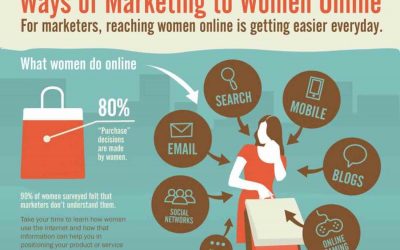
Ways of Marketing to Women Online
In marketing, it is well worth the time to learn how women use the internet and how that information can help you in positioning your product or service and in return help you to increase your conversions. This infographic explores some ways of effectively marketing to women online.
The Mobile Employee
This infographic, published by [x]cube Labs, makes readers to understand about the concepts like device ownership among employees, types of mobile employee, employee mobile preferences and work without a smartphone for a week. The in-depth analysis with exact figures will enthrall you.
Practice Makes Perfect
Students are always looking for an edge when it comes to test taking — the latest energy drink, early-morning study groups, etc. But save the caffeine because good ol’ fashioned flashcards offer some of the most significant benefits of all.
The Lifetime Costs of Pets
Do you know how much your pets are costing you? The lifetime costs of your pets could surprise you! From food and medical expenses to toys and treats, all potential pet owners should be aware of the costs involved in owning a pet. This infographic breaks down the costs of keeping our furry friends happy.
Bizarre Facts About Military Divorces
Divorce is a complicated process in the civilian world, but things get even more quirky when one of the spouses is part of the military. Most of the armed forces’ laws are far stricter than civilian law and involve the consultation of Federal law as well. This infographic looks at some of the bizarre facts surrounding military divorces.
BIG Riggin’ In America
This infographic, published by NextTruck, answers many questions about the trucking industry through a creative and statistical analysis. If you have ever dreamed about becoming a trucker, or want more information on the industry, then this infographic is for you.
Communication Channels: Facts and Figures, Pros and Cons
This infographic, published by Emailtray, focuses on some of the most popular communication channels and includes quick facts and figures on personal meetings, phone calling, emailing, instant messaging, blogging, forums and wiki; distinctive features, advantages and disadvantages of each method of communication.
Geo-Marketing and Why It Matters
Whether you have a retail location or not, you need to pay attention to the location of the consumer, and tailor your marketing message accordingly. This infographic explores geo-marketing, why it matters, and how it can be used to grow your business. This infographic briefly explores geo-marketing, why it matters, and how it can be used to grow your business.
History of Savings Accounts
In this infographic you will find the history of savings accounts and how it became what it is today. There is a lot of interesting facts and statistics available like how traces of savings accounts dates back to the 1500s.
The Fast & The Luxurious: World’s Most Expensive Cars
What are some of the world’s most expensive and quickest automobiles and even more interesting, which celebrities drive them? The following infographic, designed by Staveley Head, takes a peek.
Ways of Marketing to Women Online
In marketing, it is well worth the time to learn how women use the internet and how that information can help you in positioning your product or service and in return help you to increase your conversions. This infographic explores some ways of effectively marketing to women online.
Partners


Browse Archives By Category
Animated Infographics
Business Infographics
Career & Jobs Infographics
Education Infographics
Entertainment Industry Infographics
Environmental Infographics
Finance & Money Infographics
Food & Drink Infographics
Health Infographics
Historical Infographics
Home & Garden Infographics
Internet Infographics
Law and Legal Infographics
Lifestyle Infographics
Marketing Infographics
Offbeat Infographics
Parenting Infographics
Pets & Animals Infographics
Political Infographics
Shopping Infographics
Sports and Athletic Infographics
Technology Infographics
Transportation Infographics
Travel Infographics
Video Infographics