


Search 12,100+ Infographics!
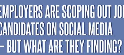
What Are Employers Finding When Scoping Job Candidates Via Social Media?
It turns out 37 percent of employers – nearly two in five companies – are using social networking sites to research job seekers’ every online move. But are they looking for beer-chugging profile pictures, or candidates who have the potential to become “Best New Employee?”
The Case for Beer
Beer – one of the oldest beverages produced by humans. In fact records dating back to 2050 B.C. show evidence of the beer trade and brew recipes. And while beer doesn’t often get much credit for being a beneficial beverage, the evidence is starting to reveal that beer is just as heart-healthy as wine.
Lead Lifecycle Analytics
Marketing automation is about more than just email marketing. According to Gleanster survey results, 43% of top performers are actually utilizing marketing automation to automate the lead life cycle. This infographic from Act-On takes a look at this in further detail.
Following the White Rabbit
Have you ever wondered what kind of people make Android applications? Well wonder no more! This new infographic from StartApp explores everything from the companies Android developers work for to the music they listen to and everything in between.
Should You Accept That Friend Request?
Who’s that person that sent you the Facebook friend request and should you accept or deny their request for permission into your personal online life? This infographic takes a humorous look at accepting friends on Facebook or not.
Leverage Yourself as an Expert by Using Social Media
Conduct some research on the most well known people in your field or industry and they probably all have one thing in common: They voice their opinions on and off the Internet and have publicly displayed contact information on one or more social media platforms. The following infographic looks at how one can leverage themselves via social media.
The Google Diet
Google is known for its data and how it optimizes its community – but did you know that they also optimize their own employees? Using their internal “People Analytics” program, Google looks at how their employees eat in their free cafeteria and optimizes it so they’re healthier, make better eating decisions, and are more productive through that process.
Social Networking Bill of Rights
As our lives become increasingly digital, many of us share more and more on social media sites. Consequentially, employers and colleagues have started to request access to our personal profiles as a way to learn more about us. Should the same standard of privacy we’ve come to expect offline apply online as well?
When and How to Vaccinate Your Kitten or Puppy
This infographic, published by Heartlandvetsupply.com, provides step-by-step instructions on what, when, how, and where to vaccinate your kitten or puppy. It includes schedules of vaccines needed for pet up to 20 weeks as well as detailed pictures of how to prepare syringe and where to inject in animal.
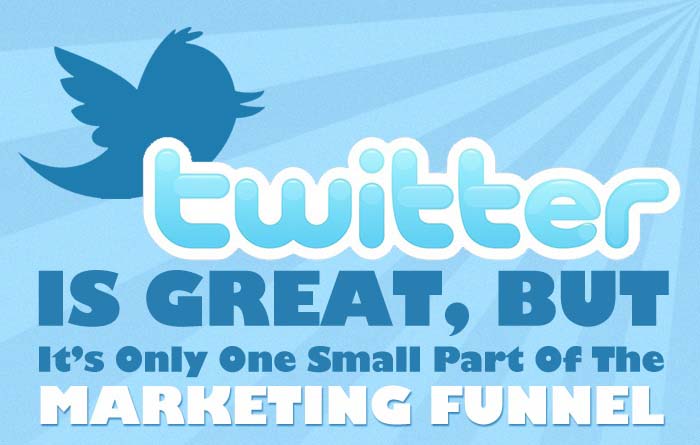
How Twitter Fits Into The Marketing Funnel
Twitter is awesome. I love Twitter and am one of its earliest adopters, but where does it fit into the grand marketing picture? This infographic by Comparz does a great job of illustrating exactly where it fits in, at least as far as business is concerned.
What Are Employers Finding When Scoping Job Candidates Via Social Media?
It turns out 37 percent of employers – nearly two in five companies – are using social networking sites to research job seekers’ every online move. But are they looking for beer-chugging profile pictures, or candidates who have the potential to become “Best New Employee?”
The Case for Beer
Beer – one of the oldest beverages produced by humans. In fact records dating back to 2050 B.C. show evidence of the beer trade and brew recipes. And while beer doesn’t often get much credit for being a beneficial beverage, the evidence is starting to reveal that beer is just as heart-healthy as wine.
Lead Lifecycle Analytics
Marketing automation is about more than just email marketing. According to Gleanster survey results, 43% of top performers are actually utilizing marketing automation to automate the lead life cycle. This infographic from Act-On takes a look at this in further detail.
Following the White Rabbit
Have you ever wondered what kind of people make Android applications? Well wonder no more! This new infographic from StartApp explores everything from the companies Android developers work for to the music they listen to and everything in between.
Should You Accept That Friend Request?
Who’s that person that sent you the Facebook friend request and should you accept or deny their request for permission into your personal online life? This infographic takes a humorous look at accepting friends on Facebook or not.
Leverage Yourself as an Expert by Using Social Media
Conduct some research on the most well known people in your field or industry and they probably all have one thing in common: They voice their opinions on and off the Internet and have publicly displayed contact information on one or more social media platforms. The following infographic looks at how one can leverage themselves via social media.
The Google Diet
Google is known for its data and how it optimizes its community – but did you know that they also optimize their own employees? Using their internal “People Analytics” program, Google looks at how their employees eat in their free cafeteria and optimizes it so they’re healthier, make better eating decisions, and are more productive through that process.
Social Networking Bill of Rights
As our lives become increasingly digital, many of us share more and more on social media sites. Consequentially, employers and colleagues have started to request access to our personal profiles as a way to learn more about us. Should the same standard of privacy we’ve come to expect offline apply online as well?
When and How to Vaccinate Your Kitten or Puppy
This infographic, published by Heartlandvetsupply.com, provides step-by-step instructions on what, when, how, and where to vaccinate your kitten or puppy. It includes schedules of vaccines needed for pet up to 20 weeks as well as detailed pictures of how to prepare syringe and where to inject in animal.
How Twitter Fits Into The Marketing Funnel
Twitter is awesome. I love Twitter and am one of its earliest adopters, but where does it fit into the grand marketing picture? This infographic by Comparz does a great job of illustrating exactly where it fits in, at least as far as business is concerned.
Partners


Browse Archives By Category
Animated Infographics
Business Infographics
Career & Jobs Infographics
Education Infographics
Entertainment Industry Infographics
Environmental Infographics
Finance & Money Infographics
Food & Drink Infographics
Health Infographics
Historical Infographics
Home & Garden Infographics
Internet Infographics
Law and Legal Infographics
Lifestyle Infographics
Marketing Infographics
Offbeat Infographics
Parenting Infographics
Pets & Animals Infographics
Political Infographics
Shopping Infographics
Sports and Athletic Infographics
Technology Infographics
Transportation Infographics
Travel Infographics
Video Infographics