
Search 12,100+ Infographics!
Mobile Mania – The Growing Importance of Mobile Website Optimization
There’s no question that mobile devices have become a staple in everyday living around the world. Now more than ever it’s important that websites be optimized for mobile devices. Mobile optimization can increase sales, generate more traffic, and boost customer engagement.
6 Reasons to Visualize Your Data
Are you suffering from information overload like most of the population today? Data visualization, otherwise known as ‘Infographics,” help people remember and digest information. A cleverly designed infographic will give you greater success in getting your sales message across.
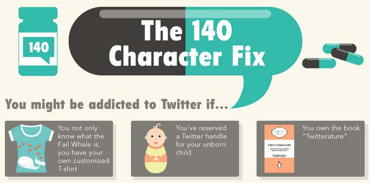
You Might Be Addicted to Twitter If…
I admit it – I’m addicted to Twitter. In fact, I can not imagine my world with out it. Apparently, I’m not alone. Celebrities have tried to kick the habit, yet failed. College students have copped to social media addiction. Research has shown that people may have a harder time resisting Twitter than alcohol, sleep and sex.
How to Train Your Employees to Handle Social Media
Social media consultants can be an expensive addition to your business. But in this day and age, no company can operate without a sound social plan. Despite the swanky pitches you may receive from pros, your best social media team might actually be your current workforce. But how can you find your company’s natural social media rockstars and get your entire team on board with your goals?
Guinness vs. Beer: Which Is Healthiest?
Whether you enjoy the dark stuff, or lean towards lager, the results show that a pint of one, or the other, can have positive effects on various areas of the body. Through painstaking research, GoIreland has worked out how many individual peanuts each drink is the equivalent to eating, how long it would take to burn off those calories and taken a look at some of the strongest beers known to mankind in the following infographic.
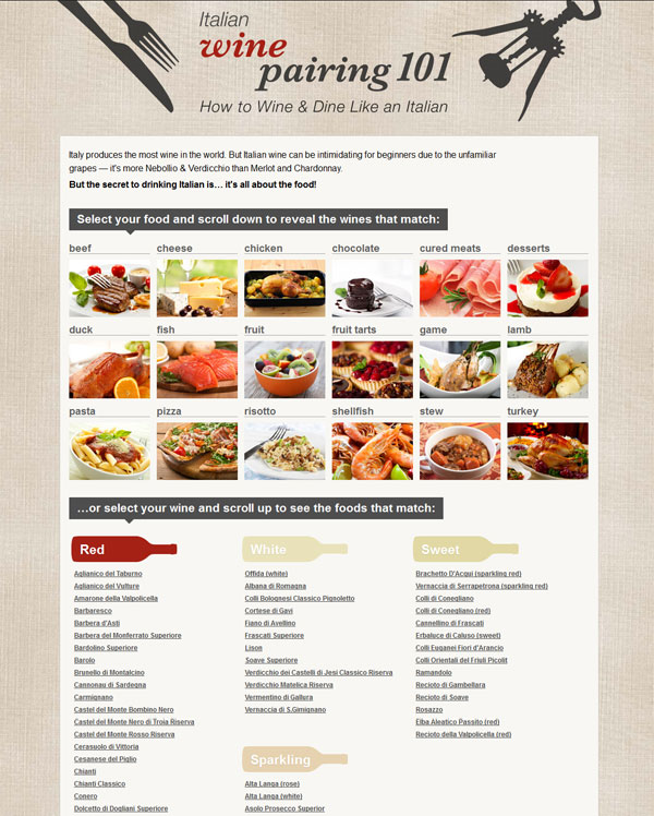
Italian Wine Pairing 101
Italy has been making wine for over 2800 years and is the largest wine producing country in the world. Italian wine is often named after the region or town where the grapes are grown – which can become confusing. This easy to use interactive infographic from Charming Sardinia shows exactly which Italian wine to pair with your food or vice versa.

Homeschool Domination: Why These Kids Will Take You Down
With America’s public school system in decline, more and more parents are turning to homeschooling as a solution to their children’s education. The surprising part? When it comes time to perform, homescholled children are blowing away everyone else out of the water.
How Social Ads Will Win the Election Ad Wars
Advertising in the social ecosystem offers presidential candidates bigger results than tweeting and Facebooking alone. Mainstream media is already asking: how big a role will social ads play in the 2012 presidential election? 140 Proof reviewed data from the 2004 and 2008 elections as well as recent reporting from AdAge, Adweek, and eMarketer in order to create this infographic about the 2012 landscape for political advertising.
Mad About March Madness
March Madness is about hardcore hoop playing by collegiate super-athletes, but the real madness of America’s favorite tournament is actually in the revenue it generates. Exclusive TV deals, colossal coach salaries and heavy betting have turned the most celebrated tradition in college sports into a numbers game. CouponCabin takes a look at that revenue and how Americans fit into the equation.
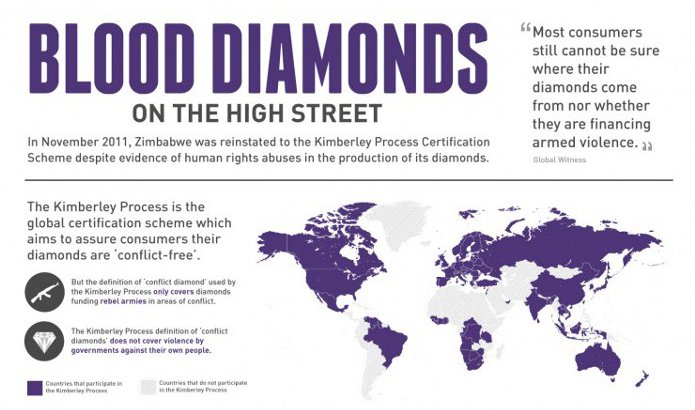
Blood Diamonds On The High Street
In 2003 the United Nations introduced the Kimberley Process Certification Scheme (KPCS) to certify that diamonds are conflict free. The KPCS defines conflict diamonds as those which are funding rebel armies in areas of conflict. One flaw in the process is that it does not recognize governments who are committing acts of violence in their own country.
Mobile Mania – The Growing Importance of Mobile Website Optimization
There’s no question that mobile devices have become a staple in everyday living around the world. Now more than ever it’s important that websites be optimized for mobile devices. Mobile optimization can increase sales, generate more traffic, and boost customer engagement.
6 Reasons to Visualize Your Data
Are you suffering from information overload like most of the population today? Data visualization, otherwise known as ‘Infographics,” help people remember and digest information. A cleverly designed infographic will give you greater success in getting your sales message across.
You Might Be Addicted to Twitter If…
I admit it – I’m addicted to Twitter. In fact, I can not imagine my world with out it. Apparently, I’m not alone. Celebrities have tried to kick the habit, yet failed. College students have copped to social media addiction. Research has shown that people may have a harder time resisting Twitter than alcohol, sleep and sex.
How to Train Your Employees to Handle Social Media
Social media consultants can be an expensive addition to your business. But in this day and age, no company can operate without a sound social plan. Despite the swanky pitches you may receive from pros, your best social media team might actually be your current workforce. But how can you find your company’s natural social media rockstars and get your entire team on board with your goals?
Guinness vs. Beer: Which Is Healthiest?
Whether you enjoy the dark stuff, or lean towards lager, the results show that a pint of one, or the other, can have positive effects on various areas of the body. Through painstaking research, GoIreland has worked out how many individual peanuts each drink is the equivalent to eating, how long it would take to burn off those calories and taken a look at some of the strongest beers known to mankind in the following infographic.
Italian Wine Pairing 101
Italy has been making wine for over 2800 years and is the largest wine producing country in the world. Italian wine is often named after the region or town where the grapes are grown – which can become confusing. This easy to use interactive infographic from Charming Sardinia shows exactly which Italian wine to pair with your food or vice versa.
Homeschool Domination: Why These Kids Will Take You Down
With America’s public school system in decline, more and more parents are turning to homeschooling as a solution to their children’s education. The surprising part? When it comes time to perform, homescholled children are blowing away everyone else out of the water.
How Social Ads Will Win the Election Ad Wars
Advertising in the social ecosystem offers presidential candidates bigger results than tweeting and Facebooking alone. Mainstream media is already asking: how big a role will social ads play in the 2012 presidential election? 140 Proof reviewed data from the 2004 and 2008 elections as well as recent reporting from AdAge, Adweek, and eMarketer in order to create this infographic about the 2012 landscape for political advertising.
Mad About March Madness
March Madness is about hardcore hoop playing by collegiate super-athletes, but the real madness of America’s favorite tournament is actually in the revenue it generates. Exclusive TV deals, colossal coach salaries and heavy betting have turned the most celebrated tradition in college sports into a numbers game. CouponCabin takes a look at that revenue and how Americans fit into the equation.
Blood Diamonds On The High Street
In 2003 the United Nations introduced the Kimberley Process Certification Scheme (KPCS) to certify that diamonds are conflict free. The KPCS defines conflict diamonds as those which are funding rebel armies in areas of conflict. One flaw in the process is that it does not recognize governments who are committing acts of violence in their own country.
Partners


Browse Archives By Category
Animated Infographics
Business Infographics
Career & Jobs Infographics
Education Infographics
Entertainment Industry Infographics
Environmental Infographics
Finance & Money Infographics
Food & Drink Infographics
Health Infographics
Historical Infographics
Home & Garden Infographics
Internet Infographics
Law and Legal Infographics
Lifestyle Infographics
Marketing Infographics
Offbeat Infographics
Parenting Infographics
Pets & Animals Infographics
Political Infographics
Shopping Infographics
Sports and Athletic Infographics
Technology Infographics
Transportation Infographics
Travel Infographics
Video Infographics