


Search 12,100+ Infographics!
No Flu For You! 6 Ways To Avoid Getting Sick
Have you been sick with the flu lately? How about a common cold of irritating cough? Did you know that you can significantly lessen your chances of getting sick by following 6 easy steps? This infographic will show you how.
The Day the Internet Stood Still
The SOPA Blackout turned out to be one of the largest protests in history which had the effect of stalling two of the most terrifying censorship bill to ever pass through the United States Congress. This infographic recounts that momentous day for social media users in tweets, emails and calls.
The World’s Most Famous Funerals
North Korea has recently bid farewell to the Beloved Leader Kim Jong Il in a ceremony that was attended by over two million people in Pyongyang. This infographic from Confused.com looks at how it measures up to some of the more fondly remembered figures of the past century.
Are Pets Good For Your Health?
Love, companionship and sloppy wet kisses are just a few of the reasons people own pets. In fact, a whopping 62% of American households own at least one kind of pet, be that a dog, cat, bird or something else. In this infographic, for which I’m not sure who originally created it, you will learn more about the connection between our health and owning pets.
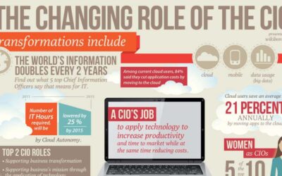
The Changing Role of the CIO
This infographic from Wikibon explores the varying and changing roles of the Chief Information Officer. The prominence of the CIO position has risen greatly as information technology has become an increasingly important aspect of the modern organization.
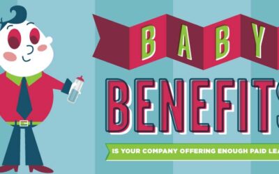
Baby Benefits: Is Your Company Offering Enough Maternity Leave?
Despite the long history of fighting for workers’ rights in this country and the cultural buzz around “family values,” the U.S. actually offers some of the weakest paid family leave benefits in the world. Though some individual states offer employees guaranteed paid family leave, a majority of new parents in the American workforce do not have many options for taking a leave.
What It Will Cost You To Go To Superbowl XLVI?
In this infographic, SeatGeek, a data-driven sports and concert ticket search engine, takes a deeper look at the all-in cost of attending this week’s Super Bowl XLVI in Indianapolis. Unless you have deep deep pockets, you might want to watch the game from the comfort of your own home.
Valentine’s Day Rocks or Sucks
When it comes to Valentine’s Day you either love it or hate it. Here are some reasons why Valentine’s Day rocks/sucks for both couples and singles. For couples you either love the whole production of the day or you feel pressured to be romantic and buy gifts. And if you’re single you either get together with your friends and celebrate SAD (Single Awareness Day) or you feel guilted and lonely by this forced commercial holiday.
One Isn’t the Loneliest Number This Valentine’s Day
Once all the New Year’s Eve celebrations are wrapped up, only one other day brings as much anxiety and awareness of singlehood – Valentine’s Day. February 14th is fast approaching, along with its endless stream of couples, roses, chocolates and hearts. But instead of wallowing in sorrow over being a party of one, take comfort in a new survey conducted by Pew Research. Turns out, more Americans are single than ever before. This infographic from CouponCabin takes a look at this research.
Finding Love in the Digital Age
With online dating being the third most popular way for singles to meet beyond friends and family in 2010 (according to Match.com), along with sex and intimacy drastically being affected by the Internet and the digital age,the Sexual Recovery Institute has used its expertise to capture this trending topic by creating an infographic.
No Flu For You! 6 Ways To Avoid Getting Sick
Have you been sick with the flu lately? How about a common cold of irritating cough? Did you know that you can significantly lessen your chances of getting sick by following 6 easy steps? This infographic will show you how.
The Day the Internet Stood Still
The SOPA Blackout turned out to be one of the largest protests in history which had the effect of stalling two of the most terrifying censorship bill to ever pass through the United States Congress. This infographic recounts that momentous day for social media users in tweets, emails and calls.
The World’s Most Famous Funerals
North Korea has recently bid farewell to the Beloved Leader Kim Jong Il in a ceremony that was attended by over two million people in Pyongyang. This infographic from Confused.com looks at how it measures up to some of the more fondly remembered figures of the past century.
Are Pets Good For Your Health?
Love, companionship and sloppy wet kisses are just a few of the reasons people own pets. In fact, a whopping 62% of American households own at least one kind of pet, be that a dog, cat, bird or something else. In this infographic, for which I’m not sure who originally created it, you will learn more about the connection between our health and owning pets.
The Changing Role of the CIO
This infographic from Wikibon explores the varying and changing roles of the Chief Information Officer. The prominence of the CIO position has risen greatly as information technology has become an increasingly important aspect of the modern organization.
Baby Benefits: Is Your Company Offering Enough Maternity Leave?
Despite the long history of fighting for workers’ rights in this country and the cultural buzz around “family values,” the U.S. actually offers some of the weakest paid family leave benefits in the world. Though some individual states offer employees guaranteed paid family leave, a majority of new parents in the American workforce do not have many options for taking a leave.
What It Will Cost You To Go To Superbowl XLVI?
In this infographic, SeatGeek, a data-driven sports and concert ticket search engine, takes a deeper look at the all-in cost of attending this week’s Super Bowl XLVI in Indianapolis. Unless you have deep deep pockets, you might want to watch the game from the comfort of your own home.
Valentine’s Day Rocks or Sucks
When it comes to Valentine’s Day you either love it or hate it. Here are some reasons why Valentine’s Day rocks/sucks for both couples and singles. For couples you either love the whole production of the day or you feel pressured to be romantic and buy gifts. And if you’re single you either get together with your friends and celebrate SAD (Single Awareness Day) or you feel guilted and lonely by this forced commercial holiday.
One Isn’t the Loneliest Number This Valentine’s Day
Once all the New Year’s Eve celebrations are wrapped up, only one other day brings as much anxiety and awareness of singlehood – Valentine’s Day. February 14th is fast approaching, along with its endless stream of couples, roses, chocolates and hearts. But instead of wallowing in sorrow over being a party of one, take comfort in a new survey conducted by Pew Research. Turns out, more Americans are single than ever before. This infographic from CouponCabin takes a look at this research.
Finding Love in the Digital Age
With online dating being the third most popular way for singles to meet beyond friends and family in 2010 (according to Match.com), along with sex and intimacy drastically being affected by the Internet and the digital age,the Sexual Recovery Institute has used its expertise to capture this trending topic by creating an infographic.
Partners


Browse Archives By Category
Animated Infographics
Business Infographics
Career & Jobs Infographics
Education Infographics
Entertainment Industry Infographics
Environmental Infographics
Finance & Money Infographics
Food & Drink Infographics
Health Infographics
Historical Infographics
Home & Garden Infographics
Internet Infographics
Law and Legal Infographics
Lifestyle Infographics
Marketing Infographics
Offbeat Infographics
Parenting Infographics
Pets & Animals Infographics
Political Infographics
Shopping Infographics
Sports and Athletic Infographics
Technology Infographics
Transportation Infographics
Travel Infographics
Video Infographics