


Search 12,100+ Infographics!
Facebook Numbers Prior to the IPO
On the heel of the news over the fact that Facebook is getting ready to file for an initial public offering this week, and most indicators point to $10 billion in stock and a valuation at over $100 billion, Statista has put together stats on the company’s mind-boggling ascendance in recent years in the following infographic.
Career Advantage: Patriots Fans vs. Giants Fans
Whichever team comes out as Superbowl champions between the Giants and the Patriots, it will be a big payday for the winning team’s players. But, what about their fans? PayScale’s career scoring system shows one team’s supporters scoring better incomes, a higher quality of life and more employment opportunities in this infographic entitled “Fan Face-Off XLVI.”
College and the Drunken Coed
In this infographic from Total DUI, learn which campuses across the nation actually expel you for DUI as well as some other interesting facts and figures related to college drinking.
How is Light Beer Light?
In this infographic from Total DUI, learn how light beer is made and what makes it “lighter” than its counterparts. Additionally some information is provided on which types of drinks will get you drunk faster as well as other factors that determine how quickly a person might get intoxicated.
Carbs Are Killing You: Eating Fat Doesn’t Make You Fat
Fat’s got a bad rap. We’ve heard that curbing our consumption of fatty foods will help you lose weight. We’ve reduced our fat intake, but obesity is still thriving. So what gives? The answer: It’s not fat’s fault. Instead, diets rich in carbohydrates have been secretly storing fat, slowly growing our waistlines and our obesity epidemic. Don’t believe it? This infographic shows how it happens.
Hand Jive: American Hand Gestures That Could Cause Trouble Abroad
It’s pretty common knowledge that “flipping some a bird” is meant as an insult to the recipient. What is not well know is that several innocent hand gestures here in the United States will not be well received in other parts of the world. This infographic designed by Pimsleur Approach contains 7 of the most offensive (and dangerous) ones.
How To Spot A Douchebag
Let’s face it – there are guys whose very appearance can compel you to turn your head in disgust, mutter the word “douchebag” in a l0ng whisper. They might be flexing in their skin-tight t-shirt, invading women’s personal space at a bar, self-promoting, etc. This humorous infographic from Online Dating University looks at some of the tell-tale signs that one might be a douchebag.
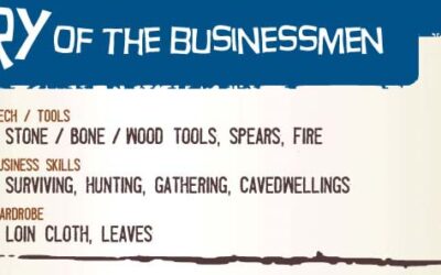
History of the Businessman
This new infographic from Business MBA takes a look back at how the businessman has evolved over time. The clever concept begins with the caveman, whose business was surviving, and leads you through the renaissance, the depression, and finally to the businessman of today.
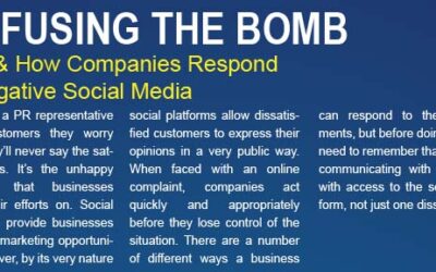
Diffusing the Bomb: Why & How Companies Respond To Negative Social Media
When faced with an online complaint, companies to act quickly and appropriately before they lose control of the situation. There are a number of different ways a business can respond to these comments, but before doing so they need to remember that they are communicating with everyone with access to the social platform, not just one dissenter.

The St. Louis Workforce
St. Louis has a surprisingly robust job market and workforce. This infographic demonstrates the opportunities you can find in a somewhat surprising place.
Facebook Numbers Prior to the IPO
On the heel of the news over the fact that Facebook is getting ready to file for an initial public offering this week, and most indicators point to $10 billion in stock and a valuation at over $100 billion, Statista has put together stats on the company’s mind-boggling ascendance in recent years in the following infographic.
Career Advantage: Patriots Fans vs. Giants Fans
Whichever team comes out as Superbowl champions between the Giants and the Patriots, it will be a big payday for the winning team’s players. But, what about their fans? PayScale’s career scoring system shows one team’s supporters scoring better incomes, a higher quality of life and more employment opportunities in this infographic entitled “Fan Face-Off XLVI.”
College and the Drunken Coed
In this infographic from Total DUI, learn which campuses across the nation actually expel you for DUI as well as some other interesting facts and figures related to college drinking.
How is Light Beer Light?
In this infographic from Total DUI, learn how light beer is made and what makes it “lighter” than its counterparts. Additionally some information is provided on which types of drinks will get you drunk faster as well as other factors that determine how quickly a person might get intoxicated.
Carbs Are Killing You: Eating Fat Doesn’t Make You Fat
Fat’s got a bad rap. We’ve heard that curbing our consumption of fatty foods will help you lose weight. We’ve reduced our fat intake, but obesity is still thriving. So what gives? The answer: It’s not fat’s fault. Instead, diets rich in carbohydrates have been secretly storing fat, slowly growing our waistlines and our obesity epidemic. Don’t believe it? This infographic shows how it happens.
Hand Jive: American Hand Gestures That Could Cause Trouble Abroad
It’s pretty common knowledge that “flipping some a bird” is meant as an insult to the recipient. What is not well know is that several innocent hand gestures here in the United States will not be well received in other parts of the world. This infographic designed by Pimsleur Approach contains 7 of the most offensive (and dangerous) ones.
How To Spot A Douchebag
Let’s face it – there are guys whose very appearance can compel you to turn your head in disgust, mutter the word “douchebag” in a l0ng whisper. They might be flexing in their skin-tight t-shirt, invading women’s personal space at a bar, self-promoting, etc. This humorous infographic from Online Dating University looks at some of the tell-tale signs that one might be a douchebag.
History of the Businessman
This new infographic from Business MBA takes a look back at how the businessman has evolved over time. The clever concept begins with the caveman, whose business was surviving, and leads you through the renaissance, the depression, and finally to the businessman of today.
Diffusing the Bomb: Why & How Companies Respond To Negative Social Media
When faced with an online complaint, companies to act quickly and appropriately before they lose control of the situation. There are a number of different ways a business can respond to these comments, but before doing so they need to remember that they are communicating with everyone with access to the social platform, not just one dissenter.
The St. Louis Workforce
St. Louis has a surprisingly robust job market and workforce. This infographic demonstrates the opportunities you can find in a somewhat surprising place.
Partners


Browse Archives By Category
Animated Infographics
Business Infographics
Career & Jobs Infographics
Education Infographics
Entertainment Industry Infographics
Environmental Infographics
Finance & Money Infographics
Food & Drink Infographics
Health Infographics
Historical Infographics
Home & Garden Infographics
Internet Infographics
Law and Legal Infographics
Lifestyle Infographics
Marketing Infographics
Offbeat Infographics
Parenting Infographics
Pets & Animals Infographics
Political Infographics
Shopping Infographics
Sports and Athletic Infographics
Technology Infographics
Transportation Infographics
Travel Infographics
Video Infographics