





Search 12,100+ Infographics!
Breaking Down Google’s 2011 Revenues
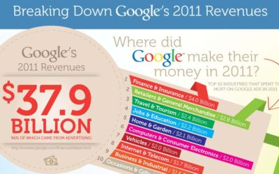
Google’s revenue for the year 2011 was $37.9 billion. With most of their products being offered for free, have you ever wondered where all of that money comes from? According to this new infographic from WordStream, 96% of it came from advertising. The infographic also breaks down the top 10 industries that spent the most on Google ads in 2011.
A Few Ways Men Can Use Pinterest
Pinterest, a fairly new social media site that allows users to “pin” their favorite pictures in a pinboard style format, is not just for women (although I’ve heard that it currently comprised of some 70% women). Men can use it as well. This infographic designed by Jack M. Block looks at some of the ways men can utilize Pinterest and still maintain their “man card.”
The Coming Age of Mobile Payments
With the increase in smart phone usage as well as mobile devices such as tablets, paying for things via those mobile devices is becoming more commonplace. Just as Internet commerce changes the way we shop and the way companies conduct business, using mobile devices to pay for things is bringing in a whole new era of change and transformation.

What Makes Facebook Social Games So Popular?
I’m not much of a fame player at all but that very likely puts me in the minority which is evidenced in this infographic from Prism Casino. Herein lies statics on some of the most popular games and general gaming statistics that may shock you.
A Technical Examination of SOPA and PIPA
Unless you’ve been hiding out in a cave or on a very extended vacation, you’ve no doubt heard about two bills that are circulating congress – SOPA (short for “Stop Online Piracy Act”) and PIPA (short for “Protect IP Act”) and all the controversy surrounding them. What you may not understand is exactly what these bills stand for and how they might impact the Internet as we know it today. This infographic explains SOPA and PIPA in a very simplistic way.

Did YouTube Kill Television?
Has the popularity of YouTube made television obsolete? Growth in television advertising has slowed while video streaming revenue continues to sky rocket. This infographic provides some interesting data on the growth of YouTube since its birth in 2005.
The Psychology of Color
Color is not as simple as it seems. According to this infographic from CertaPro Painters of Louisville, it evokes emotion and triggers your senses. With this in mind, the infographic beautifully explores colors that should and should not be used in interior decorating, as well as why certain colors are used in advertising.
SOPA vs The Film Industry
Has Hollywood already forgotten the 1950s and the blacklist? This infographic from Matador Network takes a look at the history of movie studios attempts to control the industry and how SOPA is just another tactic they are trying to utilize for that control.
The 2011 Ecommerce Holiday Season in Review
Despite a tough economy that forced consumers to think twice about every purchase, many online retailers experienced an increase in not only sales during the holiday season, but gains in traffic from mobile and tablet shoppers and other key metrics. This infographic gathers all the retail ecommerce spending stats from 2011 into one handy reference tool.
A Graphical Tribute to Edgar Allan Poe on His 203rd Birthday
January 19th is the 203rd birthday of the famous writer, Edgar Allan Poe. This infographic includes facts about the writer and the names of some of his best work.
Breaking Down Google’s 2011 Revenues
Google’s revenue for the year 2011 was $37.9 billion. With most of their products being offered for free, have you ever wondered where all of that money comes from? According to this new infographic from WordStream, 96% of it came from advertising. The infographic also breaks down the top 10 industries that spent the most on Google ads in 2011.
A Few Ways Men Can Use Pinterest
Pinterest, a fairly new social media site that allows users to “pin” their favorite pictures in a pinboard style format, is not just for women (although I’ve heard that it currently comprised of some 70% women). Men can use it as well. This infographic designed by Jack M. Block looks at some of the ways men can utilize Pinterest and still maintain their “man card.”
The Coming Age of Mobile Payments
With the increase in smart phone usage as well as mobile devices such as tablets, paying for things via those mobile devices is becoming more commonplace. Just as Internet commerce changes the way we shop and the way companies conduct business, using mobile devices to pay for things is bringing in a whole new era of change and transformation.
What Makes Facebook Social Games So Popular?
I’m not much of a fame player at all but that very likely puts me in the minority which is evidenced in this infographic from Prism Casino. Herein lies statics on some of the most popular games and general gaming statistics that may shock you.
A Technical Examination of SOPA and PIPA
Unless you’ve been hiding out in a cave or on a very extended vacation, you’ve no doubt heard about two bills that are circulating congress – SOPA (short for “Stop Online Piracy Act”) and PIPA (short for “Protect IP Act”) and all the controversy surrounding them. What you may not understand is exactly what these bills stand for and how they might impact the Internet as we know it today. This infographic explains SOPA and PIPA in a very simplistic way.
Did YouTube Kill Television?
Has the popularity of YouTube made television obsolete? Growth in television advertising has slowed while video streaming revenue continues to sky rocket. This infographic provides some interesting data on the growth of YouTube since its birth in 2005.
The Psychology of Color
Color is not as simple as it seems. According to this infographic from CertaPro Painters of Louisville, it evokes emotion and triggers your senses. With this in mind, the infographic beautifully explores colors that should and should not be used in interior decorating, as well as why certain colors are used in advertising.
SOPA vs The Film Industry
Has Hollywood already forgotten the 1950s and the blacklist? This infographic from Matador Network takes a look at the history of movie studios attempts to control the industry and how SOPA is just another tactic they are trying to utilize for that control.
The 2011 Ecommerce Holiday Season in Review
Despite a tough economy that forced consumers to think twice about every purchase, many online retailers experienced an increase in not only sales during the holiday season, but gains in traffic from mobile and tablet shoppers and other key metrics. This infographic gathers all the retail ecommerce spending stats from 2011 into one handy reference tool.
A Graphical Tribute to Edgar Allan Poe on His 203rd Birthday
January 19th is the 203rd birthday of the famous writer, Edgar Allan Poe. This infographic includes facts about the writer and the names of some of his best work.
Partners






Browse Archives By Category
Animated Infographics
Business Infographics
Career & Jobs Infographics
Education Infographics
Entertainment Industry Infographics
Environmental Infographics
Finance & Money Infographics
Food & Drink Infographics
Health Infographics
Historical Infographics
Home & Garden Infographics
Internet Infographics
Law and Legal Infographics
Lifestyle Infographics
Marketing Infographics
Offbeat Infographics
Parenting Infographics
Pets & Animals Infographics
Political Infographics
Shopping Infographics
Sports and Athletic Infographics
Technology Infographics
Transportation Infographics
Travel Infographics
Video Infographics