


Search 12,100+ Infographics!
An Overview of Data Storage Devices Over Time
Remember what the storage capacity of hard drives was in 1973, or how much a single GB of hard drive storage would have cost you in the 80′s? How about when floppy drives (remember those) were first introduced to the computing world? SPAMfighter has put together some data about hard drives and storage devices in this handy infographic timeline.
Better Than the Average Man
Let’s face it – most guys all think they are above average. But what does the average man really look like? This infographic takes a peek.
Most Common and Most Commonly Broken New Year’s Resolutions
Although we all make our new year’s resolutions with the best intentions, our commitment often fizzles out before February. In this infographic, Confused.com looks at how likely resolutions are to be abandoned and what you can do to stick to your goals.
Everything You Need To Know About Facebook’s IPO
Just like the title says, this new infographic tells you everything you need to know about Facebook’s IPO. From past internet IPOs to Facebook’s possible valuation, this infographic leaves nothing out.
Obesity Around the World
The following infographic designed by InfoGlyphs takes and interesting look at obesity around the world and how it has worsened over the years. And who do you think are some of the “fattest” people on the planet? Without looking, the country’s initials are “US.”
The Ins & Outs Of Dollar Stores
What is the real story behind “Dollar Stores?” How they survive, who shops there, and what do they look like around the world? This infographic provides the answers to these questions.
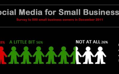
Social Media for Small Businesses
Inbox Insight recently conducted an online survey to 500 small business owners regarding their use of Social Media within their organization. The survey looked at current use of Social Media as well as plans to use it over the coming year.
3 Key Questions About U.S. Debt
Fisher Investments presents a visual depiction of the current state of the United States debt including who owns it, and answers the questions in many investors minds – can we afford it and is there too much of it?

The Benefits of Payroll Software
There are two primary methods of dealing with payroll; use dedicated payroll software or completing the paperwork and other elements manually. This infographic provides a short summary of some of the common payroll related tasks that a manager would need to carry out on a typical day. It then looks at how long these tasks would take using both payroll software as well manual payroll methods.
Apple vs Apples
We’ve all thought about things comparing apples and oranges. Let’s take it one step further and compare apples and apples. Yes, you heard right. Apples (the fruit) vs Apple (the tech company) makes for a fantastic comparative infographic.
An Overview of Data Storage Devices Over Time
Remember what the storage capacity of hard drives was in 1973, or how much a single GB of hard drive storage would have cost you in the 80′s? How about when floppy drives (remember those) were first introduced to the computing world? SPAMfighter has put together some data about hard drives and storage devices in this handy infographic timeline.
Better Than the Average Man
Let’s face it – most guys all think they are above average. But what does the average man really look like? This infographic takes a peek.
Most Common and Most Commonly Broken New Year’s Resolutions
Although we all make our new year’s resolutions with the best intentions, our commitment often fizzles out before February. In this infographic, Confused.com looks at how likely resolutions are to be abandoned and what you can do to stick to your goals.
Everything You Need To Know About Facebook’s IPO
Just like the title says, this new infographic tells you everything you need to know about Facebook’s IPO. From past internet IPOs to Facebook’s possible valuation, this infographic leaves nothing out.
Obesity Around the World
The following infographic designed by InfoGlyphs takes and interesting look at obesity around the world and how it has worsened over the years. And who do you think are some of the “fattest” people on the planet? Without looking, the country’s initials are “US.”
The Ins & Outs Of Dollar Stores
What is the real story behind “Dollar Stores?” How they survive, who shops there, and what do they look like around the world? This infographic provides the answers to these questions.
Social Media for Small Businesses
Inbox Insight recently conducted an online survey to 500 small business owners regarding their use of Social Media within their organization. The survey looked at current use of Social Media as well as plans to use it over the coming year.
3 Key Questions About U.S. Debt
Fisher Investments presents a visual depiction of the current state of the United States debt including who owns it, and answers the questions in many investors minds – can we afford it and is there too much of it?
The Benefits of Payroll Software
There are two primary methods of dealing with payroll; use dedicated payroll software or completing the paperwork and other elements manually. This infographic provides a short summary of some of the common payroll related tasks that a manager would need to carry out on a typical day. It then looks at how long these tasks would take using both payroll software as well manual payroll methods.
Apple vs Apples
We’ve all thought about things comparing apples and oranges. Let’s take it one step further and compare apples and apples. Yes, you heard right. Apples (the fruit) vs Apple (the tech company) makes for a fantastic comparative infographic.
Partners


Browse Archives By Category
Animated Infographics
Business Infographics
Career & Jobs Infographics
Education Infographics
Entertainment Industry Infographics
Environmental Infographics
Finance & Money Infographics
Food & Drink Infographics
Health Infographics
Historical Infographics
Home & Garden Infographics
Internet Infographics
Law and Legal Infographics
Lifestyle Infographics
Marketing Infographics
Offbeat Infographics
Parenting Infographics
Pets & Animals Infographics
Political Infographics
Shopping Infographics
Sports and Athletic Infographics
Technology Infographics
Transportation Infographics
Travel Infographics
Video Infographics