





Search 12,100+ Infographics!
Mobile Trends for 2012
With the growing number of Smartphone users, what will be the key trends for mobile in 2012? This infographic from Vocal highlights the direction mobile is taking in terms of apps and services and what consumers and businesses should look out for in 2012.
The Problems with Passwords
More and more of our lives are taking place online which means that quite regularly we are trusting our personal information to the cloud. Unfortunately, it seems we still have not learned how to protect ourselves. This infographic is the results of a study conducted in 2011 with 300 people ranging from high school students to adults that looks at the mistakes that are made with passwords.

Notorious Celeb Divorces of 2011
Most celebrities do not enjoy the privacy that the rest of us do when they’re going through a divorce and as a result, we get all the gory details. Some divorces are pretty standard but 2011 had is share of insane celebrity break-ups, some of which are documented in the infographic below.
An Overview of Data Storage Devices Over Time
Remember what the storage capacity of hard drives was in 1973, or how much a single GB of hard drive storage would have cost you in the 80′s? How about when floppy drives (remember those) were first introduced to the computing world? SPAMfighter has put together some data about hard drives and storage devices in this handy infographic timeline.
Better Than the Average Man
Let’s face it – most guys all think they are above average. But what does the average man really look like? This infographic takes a peek.
Most Common and Most Commonly Broken New Year’s Resolutions
Although we all make our new year’s resolutions with the best intentions, our commitment often fizzles out before February. In this infographic, Confused.com looks at how likely resolutions are to be abandoned and what you can do to stick to your goals.
Everything You Need To Know About Facebook’s IPO
Just like the title says, this new infographic tells you everything you need to know about Facebook’s IPO. From past internet IPOs to Facebook’s possible valuation, this infographic leaves nothing out.
Obesity Around the World
The following infographic designed by InfoGlyphs takes and interesting look at obesity around the world and how it has worsened over the years. And who do you think are some of the “fattest” people on the planet? Without looking, the country’s initials are “US.”
The Ins & Outs Of Dollar Stores
What is the real story behind “Dollar Stores?” How they survive, who shops there, and what do they look like around the world? This infographic provides the answers to these questions.
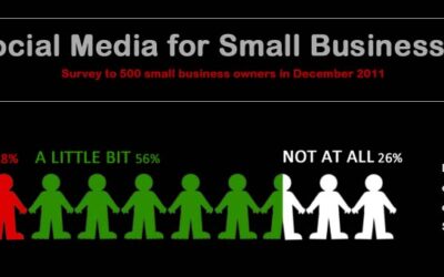
Social Media for Small Businesses
Inbox Insight recently conducted an online survey to 500 small business owners regarding their use of Social Media within their organization. The survey looked at current use of Social Media as well as plans to use it over the coming year.
Mobile Trends for 2012
With the growing number of Smartphone users, what will be the key trends for mobile in 2012? This infographic from Vocal highlights the direction mobile is taking in terms of apps and services and what consumers and businesses should look out for in 2012.
The Problems with Passwords
More and more of our lives are taking place online which means that quite regularly we are trusting our personal information to the cloud. Unfortunately, it seems we still have not learned how to protect ourselves. This infographic is the results of a study conducted in 2011 with 300 people ranging from high school students to adults that looks at the mistakes that are made with passwords.
Notorious Celeb Divorces of 2011
Most celebrities do not enjoy the privacy that the rest of us do when they’re going through a divorce and as a result, we get all the gory details. Some divorces are pretty standard but 2011 had is share of insane celebrity break-ups, some of which are documented in the infographic below.
An Overview of Data Storage Devices Over Time
Remember what the storage capacity of hard drives was in 1973, or how much a single GB of hard drive storage would have cost you in the 80′s? How about when floppy drives (remember those) were first introduced to the computing world? SPAMfighter has put together some data about hard drives and storage devices in this handy infographic timeline.
Better Than the Average Man
Let’s face it – most guys all think they are above average. But what does the average man really look like? This infographic takes a peek.
Most Common and Most Commonly Broken New Year’s Resolutions
Although we all make our new year’s resolutions with the best intentions, our commitment often fizzles out before February. In this infographic, Confused.com looks at how likely resolutions are to be abandoned and what you can do to stick to your goals.
Everything You Need To Know About Facebook’s IPO
Just like the title says, this new infographic tells you everything you need to know about Facebook’s IPO. From past internet IPOs to Facebook’s possible valuation, this infographic leaves nothing out.
Obesity Around the World
The following infographic designed by InfoGlyphs takes and interesting look at obesity around the world and how it has worsened over the years. And who do you think are some of the “fattest” people on the planet? Without looking, the country’s initials are “US.”
The Ins & Outs Of Dollar Stores
What is the real story behind “Dollar Stores?” How they survive, who shops there, and what do they look like around the world? This infographic provides the answers to these questions.
Social Media for Small Businesses
Inbox Insight recently conducted an online survey to 500 small business owners regarding their use of Social Media within their organization. The survey looked at current use of Social Media as well as plans to use it over the coming year.
Partners






Browse Archives By Category
Animated Infographics
Business Infographics
Career & Jobs Infographics
Education Infographics
Entertainment Industry Infographics
Environmental Infographics
Finance & Money Infographics
Food & Drink Infographics
Health Infographics
Historical Infographics
Home & Garden Infographics
Internet Infographics
Law and Legal Infographics
Lifestyle Infographics
Marketing Infographics
Offbeat Infographics
Parenting Infographics
Pets & Animals Infographics
Political Infographics
Shopping Infographics
Sports and Athletic Infographics
Technology Infographics
Transportation Infographics
Travel Infographics
Video Infographics