

Search 12,100+ Infographics!
The Future of Marketing: Blogging and Social Media
This Infographic from Credit Loan provides information for social media and blogging as a tool for small business, including statistical data on how many businesses in the U.S use social media and marketing to promote their business, how the rate is going to grow and what social media sites business are predominantly using.
The Importance of Local Listings
This Infographic provides statistical data for consumer use of local sites such as Yelp, Google Places and Yahoo Local to show the importance for small businesses to utilize these sites to help them grow.
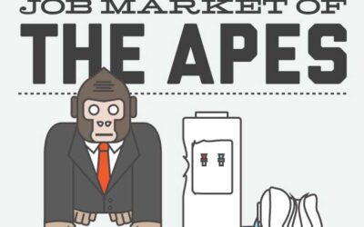
Could a Monkey Do Your Job?
You could be competing against an ape or monkey for your next job. True of false? This Infographic by Online Schools looks at how the job market is shifting, and what the future of the market might look like.
40 Facts About Fitness
In this Infographic, discover some of the interesting facts about human body and health that you probably never knew. Knowing these should give you yet another reason to love your body and take care of your health.
Digital Technology: Global Game-Changer for Social Change
Did you know that 89% of adults around the world believe that technology can turn a cause into a movement faster than anything else? This Infographic is the result of Walden University’s research into social change around the world via digital technology.
The State of Customer Service
Even in today’s economy customers still expect the best and can make or break your reputation depending on their customer experience. The following infographic takes a look at just what you can expect from a disgruntled customer as opposed to a happy one.
Your Credit Score and Why It Matters
Your credit scores is essentially a summary of how well you pay your bills, how likely you are to pay loans back, and how much credit you can receive.This Infographic provides details on what can affect your credit score positively or negatively.

The Most Commonly Misunderstood Lyrics in Music
Song lyrics are not always the easiest to understand and people are constantly embarrassing themselves by singing the weirdest lyrics ever imagined. The reason for the confusion is because of mondegreens which a misinterpretation of a phrase due to homophony.
Teen Pregnancy Facts & Statistics
Teen pregnancy has been an issue of major concern across the world, and it has been so since ages. The impact here is not just on the population but also on the associated health risks through other related issues like abortion, mental trauma, and lack of medical care. This Infographic looks at some of the shocking, alarming and surprising facts and stats on teen pregnancy.
A Shopper’s High: Are We Shopping Ourselves Out of a Bad Mood?
Admit it or not – many of today’s adults try to “shop” their worries away. But how long does this retail high last? This Infographic looks at the aftermath of a shopping spree to find out whether buying really plays positively on the emotions.
The Future of Marketing: Blogging and Social Media
This Infographic from Credit Loan provides information for social media and blogging as a tool for small business, including statistical data on how many businesses in the U.S use social media and marketing to promote their business, how the rate is going to grow and what social media sites business are predominantly using.
The Importance of Local Listings
This Infographic provides statistical data for consumer use of local sites such as Yelp, Google Places and Yahoo Local to show the importance for small businesses to utilize these sites to help them grow.
Could a Monkey Do Your Job?
You could be competing against an ape or monkey for your next job. True of false? This Infographic by Online Schools looks at how the job market is shifting, and what the future of the market might look like.
40 Facts About Fitness
In this Infographic, discover some of the interesting facts about human body and health that you probably never knew. Knowing these should give you yet another reason to love your body and take care of your health.
Digital Technology: Global Game-Changer for Social Change
Did you know that 89% of adults around the world believe that technology can turn a cause into a movement faster than anything else? This Infographic is the result of Walden University’s research into social change around the world via digital technology.
The State of Customer Service
Even in today’s economy customers still expect the best and can make or break your reputation depending on their customer experience. The following infographic takes a look at just what you can expect from a disgruntled customer as opposed to a happy one.
Your Credit Score and Why It Matters
Your credit scores is essentially a summary of how well you pay your bills, how likely you are to pay loans back, and how much credit you can receive.This Infographic provides details on what can affect your credit score positively or negatively.
The Most Commonly Misunderstood Lyrics in Music
Song lyrics are not always the easiest to understand and people are constantly embarrassing themselves by singing the weirdest lyrics ever imagined. The reason for the confusion is because of mondegreens which a misinterpretation of a phrase due to homophony.
Teen Pregnancy Facts & Statistics
Teen pregnancy has been an issue of major concern across the world, and it has been so since ages. The impact here is not just on the population but also on the associated health risks through other related issues like abortion, mental trauma, and lack of medical care. This Infographic looks at some of the shocking, alarming and surprising facts and stats on teen pregnancy.
A Shopper’s High: Are We Shopping Ourselves Out of a Bad Mood?
Admit it or not – many of today’s adults try to “shop” their worries away. But how long does this retail high last? This Infographic looks at the aftermath of a shopping spree to find out whether buying really plays positively on the emotions.
Partners


Browse Archives By Category
Animated Infographics
Business Infographics
Career & Jobs Infographics
Education Infographics
Entertainment Industry Infographics
Environmental Infographics
Finance & Money Infographics
Food & Drink Infographics
Health Infographics
Historical Infographics
Home & Garden Infographics
Internet Infographics
Law and Legal Infographics
Lifestyle Infographics
Marketing Infographics
Offbeat Infographics
Parenting Infographics
Pets & Animals Infographics
Political Infographics
Shopping Infographics
Sports and Athletic Infographics
Technology Infographics
Transportation Infographics
Travel Infographics
Video Infographics