
Search 12,100+ Infographics!
Branding and How It Works in the Social Media Age
AYTM Market Research surveyed 2,000 Internet users, asking a variety of questions including how they like to receive updates about their favorite brands, where they hang out online, and whether prospective customers prefer to interact with brands on social media or elsewhere. This Infographic provides the results of that survey.
Amazing Travel and Vacation Destinations in the U.S.
Looking to get away, and want to make it something to write home about? Check out this Infographic that shows some of the most noteworthy places to stay, the most unusual trips to take, outrageous spa treatments, and more!
Why You Need an Inbound Marketing Agency
Trying to figure out how to do Inbound Marketing? Check out this Infographic to learn why hiring an inbound marketing agency makes all the sense in the world.
Planning For Retirement (When I’m 64)
Baby boomers, who account for nearly 1/4 of Americans, are getting close to retirement age. The U.S. population age 45 and older is growing 18 times faster than the younger generation. This Infographic shows some of the best retirement options in today’s economy for those on the brink of clocking out of the workforce.
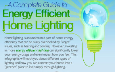
Complete Guide to Energy Efficient Home Lighting
A very concise Infographic that provides information on energy efficient home lighting including an explanation of the different kinds of light bulbs as well as tips on how to use light bulbs with more efficiency. Lengthy but well worth the look!
How To Build A Panic Room
Every since I saw the 2002 feature film, Panic Room, I’ve wanted one of my own. Of course, that will have to wait till when (and if) we build a custom home. This Infographic provides some guidelines on building a panic room the right way.
Evolution of Coupons and Discount Codes
Did you know that coupons were first conceived by Asa Candler, who used paper tickets for free glasses of Coke to help market his new soda? Discover how coupons and discount codes have evolved over time in the nifty Infographic.
We Love Sleeping
In this infographic, learn some very interesting things about sleep habits of people as well as what happens while your sleep.
Epic Retail Fails 2011
It’s been a rough couple of years for retail, but it’s been especially bad for some. And while it looks like there is a bright spot on the horizon in the form of slightly lower unemployment numbers and slightly higher consumer confidence numbers, we still saw some major missteps in 2011, from branding to customer service to handling the press.
The Professional Services Marketing Revolution
Did you know that professional services firms that embrace online marketing grow 4x faster and are 2x more profitable than firms that rely on traditional marketing alone? This Infographic published by Hinge tells the story of how online marketing techniques are driving professional services firm success.
Branding and How It Works in the Social Media Age
AYTM Market Research surveyed 2,000 Internet users, asking a variety of questions including how they like to receive updates about their favorite brands, where they hang out online, and whether prospective customers prefer to interact with brands on social media or elsewhere. This Infographic provides the results of that survey.
Amazing Travel and Vacation Destinations in the U.S.
Looking to get away, and want to make it something to write home about? Check out this Infographic that shows some of the most noteworthy places to stay, the most unusual trips to take, outrageous spa treatments, and more!
Why You Need an Inbound Marketing Agency
Trying to figure out how to do Inbound Marketing? Check out this Infographic to learn why hiring an inbound marketing agency makes all the sense in the world.
Planning For Retirement (When I’m 64)
Baby boomers, who account for nearly 1/4 of Americans, are getting close to retirement age. The U.S. population age 45 and older is growing 18 times faster than the younger generation. This Infographic shows some of the best retirement options in today’s economy for those on the brink of clocking out of the workforce.
Complete Guide to Energy Efficient Home Lighting
A very concise Infographic that provides information on energy efficient home lighting including an explanation of the different kinds of light bulbs as well as tips on how to use light bulbs with more efficiency. Lengthy but well worth the look!
How To Build A Panic Room
Every since I saw the 2002 feature film, Panic Room, I’ve wanted one of my own. Of course, that will have to wait till when (and if) we build a custom home. This Infographic provides some guidelines on building a panic room the right way.
Evolution of Coupons and Discount Codes
Did you know that coupons were first conceived by Asa Candler, who used paper tickets for free glasses of Coke to help market his new soda? Discover how coupons and discount codes have evolved over time in the nifty Infographic.
We Love Sleeping
In this infographic, learn some very interesting things about sleep habits of people as well as what happens while your sleep.
Epic Retail Fails 2011
It’s been a rough couple of years for retail, but it’s been especially bad for some. And while it looks like there is a bright spot on the horizon in the form of slightly lower unemployment numbers and slightly higher consumer confidence numbers, we still saw some major missteps in 2011, from branding to customer service to handling the press.
The Professional Services Marketing Revolution
Did you know that professional services firms that embrace online marketing grow 4x faster and are 2x more profitable than firms that rely on traditional marketing alone? This Infographic published by Hinge tells the story of how online marketing techniques are driving professional services firm success.
Partners


Browse Archives By Category
Animated Infographics
Business Infographics
Career & Jobs Infographics
Education Infographics
Entertainment Industry Infographics
Environmental Infographics
Finance & Money Infographics
Food & Drink Infographics
Health Infographics
Historical Infographics
Home & Garden Infographics
Internet Infographics
Law and Legal Infographics
Lifestyle Infographics
Marketing Infographics
Offbeat Infographics
Parenting Infographics
Pets & Animals Infographics
Political Infographics
Shopping Infographics
Sports and Athletic Infographics
Technology Infographics
Transportation Infographics
Travel Infographics
Video Infographics