


Search 12,100+ Infographics!

Unfit Cleaning Services
Cleaning in London can be more demanding than most other places due to the congestion making traveling difficult as well as expensive. Additionally, because London is so vastly populated, places can accumulate dirt a lot quicker than other places. This infographic highlights unfit cleaning services.
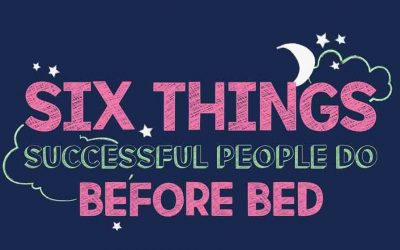
Six Things Successful People Do Before Bed
Have you been struggling at work recently? Feeling exhausted and finding it difficult to motivate yourself? Or even finding yourself more emotional or more likely to snack on food? Your sleep, or lack thereof, might be having more of an effect on than you think. The Sleep Matters Club has come up with a few tips to help you get a full night’s rest and consequently have a productive following day.

9 Data Sets Every Ecommerce Company Should Measure
One of the biggest challenges for any eCommerce company is measuring eCommerce results. There are several metrics to look at when analyzing the success of an online business. In the following infographic, Info Graphic Design Team looks at 9 data sets every eCommerce company should measure.
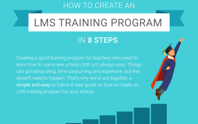
How to Create an LMS Training Program in 8 Steps
Creating a good training program for teachers who need to learn how to use a new school LMS isn’t always easy. Things can get exhausting, time-consuming and expensive, but this doesn’t need to happen. That’s why the team at Neo LMS have put together a simple and easy to follow 8-step guide on how to create an LMS training program for your school.
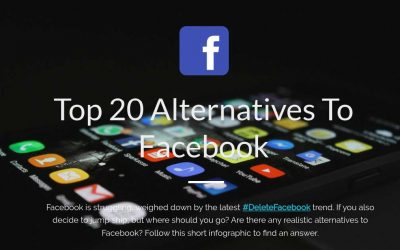
Top 20 Best Alternatives To Facebook
With Facebook mired in a controversy over the misuse of the data of 50 million of its users by the company Cambridge Analytica, people have started thinking about alternatives to Facebook. The following infographic courtesy of MiniCreo has a lot of very interesting facts and stats about Facebook alternatives.
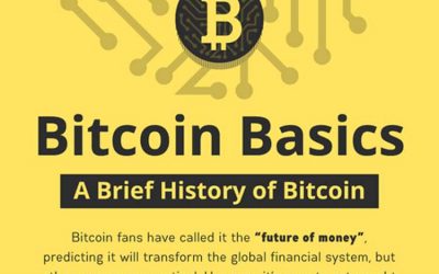
A Brief History of Bitcoin
Bitcoin fans have called it the “future of money”, predicting it will transform the global financial system, but others are more skeptical. However, it’s easy to get caught up in technical jargon if you don’t understand the basics. Here is an easy to follow guide from CartwrightKing to help you understand the basics of Bitcoin, where it came from and what you can do to get involved.

From Millionaire to Billionaire
This infographic looks into the data behind the world’s richest people. Using Forbe’s The World’s Billionaires List, the team at Betway looked into ages, industries, and education of the mega-rich to find out how quickly (or slowly) they’ve gone from millionaire to billionaire.

11 Differences Between iOS and Android App Testing
Android and iOS owns a major share of hand held device OS at present. Among these two, Android users are of the highest in number. Even though some of the same apps available in both operating systems, the process involved in testing them are different owing to various factors. In the following infographic, look at 11 differences between iOS and Android app testing.
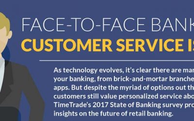
The State of Banking 2017
As technology evolves, there are more ways to do your banking, from brick-and-mortar branches to mobile apps. But despite the myriad of options, customers still value personalized service. This infographic highlights results from the TimeTrade State of Banking 2017 consumer survey.

The Ultimate Social Media Image Size Cheat Sheet
Speed up your social media presence with the right size and dimension of your infographics. This infographic shows you the different images sizes for all the major social media platforms. You will be able to create the perfect visuals for your brand’s social media handles and stand out.
Unfit Cleaning Services
Cleaning in London can be more demanding than most other places due to the congestion making traveling difficult as well as expensive. Additionally, because London is so vastly populated, places can accumulate dirt a lot quicker than other places. This infographic highlights unfit cleaning services.
Six Things Successful People Do Before Bed
Have you been struggling at work recently? Feeling exhausted and finding it difficult to motivate yourself? Or even finding yourself more emotional or more likely to snack on food? Your sleep, or lack thereof, might be having more of an effect on than you think. The Sleep Matters Club has come up with a few tips to help you get a full night’s rest and consequently have a productive following day.
9 Data Sets Every Ecommerce Company Should Measure
One of the biggest challenges for any eCommerce company is measuring eCommerce results. There are several metrics to look at when analyzing the success of an online business. In the following infographic, Info Graphic Design Team looks at 9 data sets every eCommerce company should measure.
How to Create an LMS Training Program in 8 Steps
Creating a good training program for teachers who need to learn how to use a new school LMS isn’t always easy. Things can get exhausting, time-consuming and expensive, but this doesn’t need to happen. That’s why the team at Neo LMS have put together a simple and easy to follow 8-step guide on how to create an LMS training program for your school.
Top 20 Best Alternatives To Facebook
With Facebook mired in a controversy over the misuse of the data of 50 million of its users by the company Cambridge Analytica, people have started thinking about alternatives to Facebook. The following infographic courtesy of MiniCreo has a lot of very interesting facts and stats about Facebook alternatives.
A Brief History of Bitcoin
Bitcoin fans have called it the “future of money”, predicting it will transform the global financial system, but others are more skeptical. However, it’s easy to get caught up in technical jargon if you don’t understand the basics. Here is an easy to follow guide from CartwrightKing to help you understand the basics of Bitcoin, where it came from and what you can do to get involved.
From Millionaire to Billionaire
This infographic looks into the data behind the world’s richest people. Using Forbe’s The World’s Billionaires List, the team at Betway looked into ages, industries, and education of the mega-rich to find out how quickly (or slowly) they’ve gone from millionaire to billionaire.
11 Differences Between iOS and Android App Testing
Android and iOS owns a major share of hand held device OS at present. Among these two, Android users are of the highest in number. Even though some of the same apps available in both operating systems, the process involved in testing them are different owing to various factors. In the following infographic, look at 11 differences between iOS and Android app testing.
The State of Banking 2017
As technology evolves, there are more ways to do your banking, from brick-and-mortar branches to mobile apps. But despite the myriad of options, customers still value personalized service. This infographic highlights results from the TimeTrade State of Banking 2017 consumer survey.
The Ultimate Social Media Image Size Cheat Sheet
Speed up your social media presence with the right size and dimension of your infographics. This infographic shows you the different images sizes for all the major social media platforms. You will be able to create the perfect visuals for your brand’s social media handles and stand out.
Partners


Browse Archives By Category
Animated Infographics
Business Infographics
Career & Jobs Infographics
Education Infographics
Entertainment Industry Infographics
Environmental Infographics
Finance & Money Infographics
Food & Drink Infographics
Health Infographics
Historical Infographics
Home & Garden Infographics
Internet Infographics
Law and Legal Infographics
Lifestyle Infographics
Marketing Infographics
Offbeat Infographics
Parenting Infographics
Pets & Animals Infographics
Political Infographics
Shopping Infographics
Sports and Athletic Infographics
Technology Infographics
Transportation Infographics
Travel Infographics
Video Infographics