

Search 12,100+ Infographics!
Ecommerce SEO Checklist: How to Survive in Ecommerce SEO Maze
SEO optimization of an ecommerce store can be tricky sometimes. The team at Promodo.com doesn’t want e-retail business owners to get lost in SEO issues maze which is why they have visualized this checklist to help ecommerce owners.
Online Consumer Habits by Country
Ecommerce evolves very quickly. To make sure your are keeping in line with the consumer habits from the largest markets in the world, check out this infographic from the folks at Promodo.com.
Helping Your Child Cope With Loss
When a loved one dies, it can be difficult to know how to help children cope with the loss, particularly as you work through your own grief. This infographic aims to guide parents and family on how to help a child understand and process their feelings in the event of a loss including helpful tips on introducing the concept of death to a child and even highlighting ‘what not to say’.
The Forgotten Impact of Billboard Marketing
Billboard marketing has been a staple of the advertising industry for some time now. With so much focus on online and television marketing, these days some businesses may disregard the influence of billboards. Is it time to return to our roots? This infographic from Signarama explores this issue.
Bulking Up Guide
We hear stories about how people struggle to lose weight, however we rarely hear about those people that actually want and need to put on weight. This infographic from looks at how to “bulk up.”
9 Architectural Wonders of Singapore
Singapore has attracted visitors for a long time with its incredible blend of historic and modern features. Visit this beautiful country and with the help of this interesting infographic by Cheapflights, find out what you can’t miss during your visit.
Wearable Technology: The Next Big Thing?
This infographic describes how wearable technology is the next big thing and how it can expand vastly in the coming years. The insurance industry is working on adopting this technology in the near future.
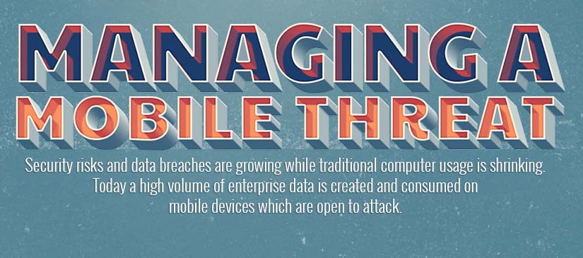
Managing a Mobile Threat
This infographic from Neon SMS explores the mobile threats that exist for businesses, and provides some helpful information on how to draft and effective mobile security policy.
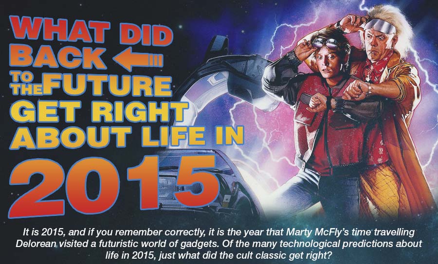
What Did Back to the Future Get Right About Life in 2015?
We have now reached 2015 and if you remember correctly it is the year that Marty McFly’s time traveling Delorean arrived in the future. From flying cars to automated vending, the film offered a glimpse at what life would be like in 2015. Of the many technological predictions made in the film, this infographic explores what it got right, what it got wrong and gets some expert insight from futurologists about today’s technological world.
Natural Disasters – Can We Help?
Natural hazards do not have to become natural disasters. The death tolls from these tragedies can be minimized with better planning and more efficient use of donations. This infographic looks at natural disasters and how we can help.
Ecommerce SEO Checklist: How to Survive in Ecommerce SEO Maze
SEO optimization of an ecommerce store can be tricky sometimes. The team at Promodo.com doesn’t want e-retail business owners to get lost in SEO issues maze which is why they have visualized this checklist to help ecommerce owners.
Online Consumer Habits by Country
Ecommerce evolves very quickly. To make sure your are keeping in line with the consumer habits from the largest markets in the world, check out this infographic from the folks at Promodo.com.
Helping Your Child Cope With Loss
When a loved one dies, it can be difficult to know how to help children cope with the loss, particularly as you work through your own grief. This infographic aims to guide parents and family on how to help a child understand and process their feelings in the event of a loss including helpful tips on introducing the concept of death to a child and even highlighting ‘what not to say’.
The Forgotten Impact of Billboard Marketing
Billboard marketing has been a staple of the advertising industry for some time now. With so much focus on online and television marketing, these days some businesses may disregard the influence of billboards. Is it time to return to our roots? This infographic from Signarama explores this issue.
Bulking Up Guide
We hear stories about how people struggle to lose weight, however we rarely hear about those people that actually want and need to put on weight. This infographic from looks at how to “bulk up.”
9 Architectural Wonders of Singapore
Singapore has attracted visitors for a long time with its incredible blend of historic and modern features. Visit this beautiful country and with the help of this interesting infographic by Cheapflights, find out what you can’t miss during your visit.
Wearable Technology: The Next Big Thing?
This infographic describes how wearable technology is the next big thing and how it can expand vastly in the coming years. The insurance industry is working on adopting this technology in the near future.
Managing a Mobile Threat
This infographic from Neon SMS explores the mobile threats that exist for businesses, and provides some helpful information on how to draft and effective mobile security policy.
What Did Back to the Future Get Right About Life in 2015?
We have now reached 2015 and if you remember correctly it is the year that Marty McFly’s time traveling Delorean arrived in the future. From flying cars to automated vending, the film offered a glimpse at what life would be like in 2015. Of the many technological predictions made in the film, this infographic explores what it got right, what it got wrong and gets some expert insight from futurologists about today’s technological world.
Natural Disasters – Can We Help?
Natural hazards do not have to become natural disasters. The death tolls from these tragedies can be minimized with better planning and more efficient use of donations. This infographic looks at natural disasters and how we can help.
Partners


Browse Archives By Category
Animated Infographics
Business Infographics
Career & Jobs Infographics
Education Infographics
Entertainment Industry Infographics
Environmental Infographics
Finance & Money Infographics
Food & Drink Infographics
Health Infographics
Historical Infographics
Home & Garden Infographics
Internet Infographics
Law and Legal Infographics
Lifestyle Infographics
Marketing Infographics
Offbeat Infographics
Parenting Infographics
Pets & Animals Infographics
Political Infographics
Shopping Infographics
Sports and Athletic Infographics
Technology Infographics
Transportation Infographics
Travel Infographics
Video Infographics