





Search 12,100+ Infographics!

The 7 Deadly Sleep Depriving Monsters
Carpetright have identified the 7 deadly sleep depriving monsters from their continued research on dreams and sleep habits in the UK. Follow the fun animated infographic to discover the troublesome monsters that are keeping you awake at night. From the familiar snore monster in the household keeping everyone awake, to the greedy snack monster leading you to the kitchen at the early hours of the morning.
Godzilla: The World’s Most Expensive Mistake?
With the new Godzilla film set to be the biggest movie event of the year,the folks at Freedom Finance tallied up all of the notable buildings that Godzilla has destroyed over the last 60 years and worked out how much it would cost to rebuild them today. In USD, GBP & Japanese Yen.
Tips on Travelling Abroad with Medications
We understand preparing to travel abroad is both exciting and quite possibly nerve-wracking. There are lots of variables to consider and some you might miss if you aren’t careful. When it comes to bringing along medications, one thing is for sure; it can be especially stressful when having to think about all of the requirements and restrictions.

Is Your Business Ready For a Visit From the HSE?
This infographic from Safer Sphere is all about seeing if your business will pass the HSE requirements and reveals some interesting facts and figures from the industry, giving you some food for thought.
The Ultimate Social Media Cheat Sheet on Word Science
There is a word science to make your content and posts shareable. Any marketer worth their salt knows what and why user attracts to share content or post. This infographic looks at this in more detail.

The Geography of Taxation
An old expression tells us that there are two certainties in life: death and taxes. While that is certainly an exaggeration, most people can appreciate the financial weight that taxes put upon them. This infographic provides a breakdown of some of the highest and lowest rates in the U.S.
Top Cities for Young Professionals and Families
Chances are, if you’ve come this far, you are reasonably sure about what you want to do with your life vocationally. However, one thing you may have not considered is where you want to do it. Selecting a place to live and start your career is one of the biggest decisions you can make. Choosing wisely can affect your quality of life significantly, as well as ease the way for subsequent decisions, such as purchasing a home or starting a family.
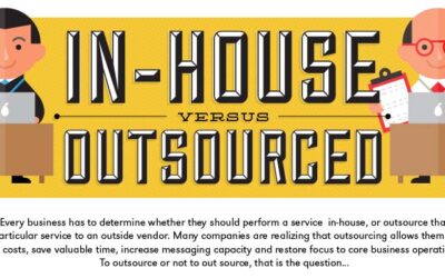
Benefits of Outsourcing for Your Business
So you’re thinking about outsourcing? Good for you. It’s a great way to save money and improve your operations. It’s not for everyone though. To help you learn more about the benefits of outsourcing, Ignite Spot has put together this infographic for you. They are in fact the outsourced accounting department for over 500 companies, so over the years, they have learned all about the benefits of outsourcing as well as some of the pitfalls.
Causes of Hearing Loss and the Methods to Reduce its Risk
Are you one of those who suffer from hearing loss? See the following infographic from Yoga Health Tips to learn more about what are its causes and precautions to take so that you can enjoy good hearing as long as possible.

The Meteoric Rise of Pop-up Retail
The Meteoric Rise of Pop-up Retail by Vend Retail Blog explores this dynamic and agile retail trend. It’ll give you interesting tidbits and research-backed data about the industry, so you can make an informed decision about starting and running pop-ups.
The 7 Deadly Sleep Depriving Monsters
Carpetright have identified the 7 deadly sleep depriving monsters from their continued research on dreams and sleep habits in the UK. Follow the fun animated infographic to discover the troublesome monsters that are keeping you awake at night. From the familiar snore monster in the household keeping everyone awake, to the greedy snack monster leading you to the kitchen at the early hours of the morning.
Godzilla: The World’s Most Expensive Mistake?
With the new Godzilla film set to be the biggest movie event of the year,the folks at Freedom Finance tallied up all of the notable buildings that Godzilla has destroyed over the last 60 years and worked out how much it would cost to rebuild them today. In USD, GBP & Japanese Yen.
Tips on Travelling Abroad with Medications
We understand preparing to travel abroad is both exciting and quite possibly nerve-wracking. There are lots of variables to consider and some you might miss if you aren’t careful. When it comes to bringing along medications, one thing is for sure; it can be especially stressful when having to think about all of the requirements and restrictions.
Is Your Business Ready For a Visit From the HSE?
This infographic from Safer Sphere is all about seeing if your business will pass the HSE requirements and reveals some interesting facts and figures from the industry, giving you some food for thought.
The Ultimate Social Media Cheat Sheet on Word Science
There is a word science to make your content and posts shareable. Any marketer worth their salt knows what and why user attracts to share content or post. This infographic looks at this in more detail.
The Geography of Taxation
An old expression tells us that there are two certainties in life: death and taxes. While that is certainly an exaggeration, most people can appreciate the financial weight that taxes put upon them. This infographic provides a breakdown of some of the highest and lowest rates in the U.S.
Top Cities for Young Professionals and Families
Chances are, if you’ve come this far, you are reasonably sure about what you want to do with your life vocationally. However, one thing you may have not considered is where you want to do it. Selecting a place to live and start your career is one of the biggest decisions you can make. Choosing wisely can affect your quality of life significantly, as well as ease the way for subsequent decisions, such as purchasing a home or starting a family.
Benefits of Outsourcing for Your Business
So you’re thinking about outsourcing? Good for you. It’s a great way to save money and improve your operations. It’s not for everyone though. To help you learn more about the benefits of outsourcing, Ignite Spot has put together this infographic for you. They are in fact the outsourced accounting department for over 500 companies, so over the years, they have learned all about the benefits of outsourcing as well as some of the pitfalls.
Causes of Hearing Loss and the Methods to Reduce its Risk
Are you one of those who suffer from hearing loss? See the following infographic from Yoga Health Tips to learn more about what are its causes and precautions to take so that you can enjoy good hearing as long as possible.
The Meteoric Rise of Pop-up Retail
The Meteoric Rise of Pop-up Retail by Vend Retail Blog explores this dynamic and agile retail trend. It’ll give you interesting tidbits and research-backed data about the industry, so you can make an informed decision about starting and running pop-ups.
Partners






Browse Archives By Category
Animated Infographics
Business Infographics
Career & Jobs Infographics
Education Infographics
Entertainment Industry Infographics
Environmental Infographics
Finance & Money Infographics
Food & Drink Infographics
Health Infographics
Historical Infographics
Home & Garden Infographics
Internet Infographics
Law and Legal Infographics
Lifestyle Infographics
Marketing Infographics
Offbeat Infographics
Parenting Infographics
Pets & Animals Infographics
Political Infographics
Shopping Infographics
Sports and Athletic Infographics
Technology Infographics
Transportation Infographics
Travel Infographics
Video Infographics