


Search 12,000+ Infographics!

Hacking Your Way Through College
College doesn’t seem as overwhelming if you know how to hack your way through it. Check out the following infographic presented by BestCollegeReviews.org to learn how to survive college.

How Big is Google
Google is arguably the king of the Internet. While their stats for some measures are not number #1, they take top place for many other measures to make up for it. BestComputerScienceDegrees.com has put together some stats and facts that may give you an idea of how big Google really is.

Skewed: Income Inequality in America
Opportunity in America: It’s shrinking. Lowest 60% of earners are making less than the wealthiest 400 Americans: $1.22 trillion vs. $1.27 trillion. In the following infographic, take a look at income equality in America.
Invisible Wounds: PTSD
Post traumatic stress disorder is a mental health condition triggered by a traumatic event. It can include symptoms such as nightmares, extreme anxiety and flashbacks. Check out the infographic below to learn more about PTSD.

The 10 New Rules of Crisis Communications
The Agnes + Day crisis intelligence team has designed an infographic that showcases the very important 10 new rules of crisis communications. Please feel free to print it for your team and/or share it with your network.

What Valentines Want
Shari’s Berries surveyed over 1,000 men and women about everything from the treats they crave to the when, where and how of celebrating Valentine’s Day. The data they collected has been compiled into the following infographic.
Understanding Google Average Position Rankings
When it comes to online marketing data, some of the metrics and terminology can be confusing. One of the most helpful things you can look at is your site’s Google average position rankings. This infographic from shows how Google calculates average position and why this is an important way to measure your online success.
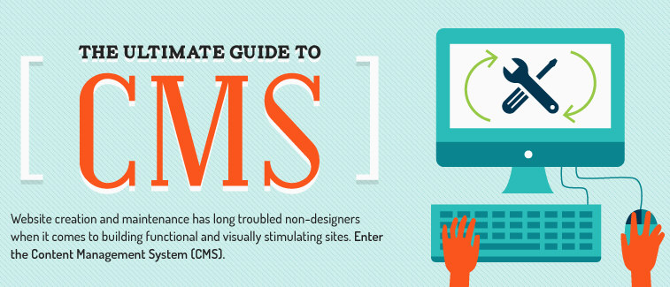
Ultimate Guide to CMS
There are plenty of Content Management System options out there, but there’s no one-size fits-all. Some platforms work better for e-commerce businesses and content while other cater to sites with more visual and editorial content. The fact is that it can be a little overwhelming so the folks at Bluehost created the infographic below to give you a breakdown of some of the most popular and reliable CMS options.
Computer Hogging Your Family Time?
U.S. adults waste an average of 16 minutes per day waiting for their computers to “catch up.” Check out the infographic below to learn more about how slow computers are taking away from our family time and other activities.
FIFA World Cup Brazil 2014 vs 1950
This infographic looks into the World Cups of 2014 and 1950 in Brazil. It compares aspects such as changes in the tournament, football economy, the economy and the infrastructure of Brazil.
Hacking Your Way Through College
College doesn’t seem as overwhelming if you know how to hack your way through it. Check out the following infographic presented by BestCollegeReviews.org to learn how to survive college.
How Big is Google
Google is arguably the king of the Internet. While their stats for some measures are not number #1, they take top place for many other measures to make up for it. BestComputerScienceDegrees.com has put together some stats and facts that may give you an idea of how big Google really is.
Skewed: Income Inequality in America
Opportunity in America: It’s shrinking. Lowest 60% of earners are making less than the wealthiest 400 Americans: $1.22 trillion vs. $1.27 trillion. In the following infographic, take a look at income equality in America.
Invisible Wounds: PTSD
Post traumatic stress disorder is a mental health condition triggered by a traumatic event. It can include symptoms such as nightmares, extreme anxiety and flashbacks. Check out the infographic below to learn more about PTSD.
The 10 New Rules of Crisis Communications
The Agnes + Day crisis intelligence team has designed an infographic that showcases the very important 10 new rules of crisis communications. Please feel free to print it for your team and/or share it with your network.
What Valentines Want
Shari’s Berries surveyed over 1,000 men and women about everything from the treats they crave to the when, where and how of celebrating Valentine’s Day. The data they collected has been compiled into the following infographic.
Understanding Google Average Position Rankings
When it comes to online marketing data, some of the metrics and terminology can be confusing. One of the most helpful things you can look at is your site’s Google average position rankings. This infographic from shows how Google calculates average position and why this is an important way to measure your online success.
Ultimate Guide to CMS
There are plenty of Content Management System options out there, but there’s no one-size fits-all. Some platforms work better for e-commerce businesses and content while other cater to sites with more visual and editorial content. The fact is that it can be a little overwhelming so the folks at Bluehost created the infographic below to give you a breakdown of some of the most popular and reliable CMS options.
Computer Hogging Your Family Time?
U.S. adults waste an average of 16 minutes per day waiting for their computers to “catch up.” Check out the infographic below to learn more about how slow computers are taking away from our family time and other activities.
FIFA World Cup Brazil 2014 vs 1950
This infographic looks into the World Cups of 2014 and 1950 in Brazil. It compares aspects such as changes in the tournament, football economy, the economy and the infrastructure of Brazil.
Partners


Browse Archives By Category
Animated Infographics
Business Infographics
Career & Jobs Infographics
Education Infographics
Entertainment Industry Infographics
Environmental Infographics
Finance & Money Infographics
Food & Drink Infographics
Health Infographics
Historical Infographics
Home & Garden Infographics
Internet Infographics
Law and Legal Infographics
Lifestyle Infographics
Marketing Infographics
Offbeat Infographics
Parenting Infographics
Pets & Animals Infographics
Political Infographics
Shopping Infographics
Sports and Athletic Infographics
Technology Infographics
Transportation Infographics
Travel Infographics
Video Infographics