





Search 12,100+ Infographics!
The Ultimate Social Media Guide to Getting a Job
Here is an infographic from the folks at CIPHR.com about how much you can further your career when you utilize social media, specifically hashtags, Twitter and Facebook.
The Most Incredible Luxury Items That Money Can Buy
The lives of the rich and the famous has always been a fascinating subject to most people in the United States. Whether it is reading about where they went on vacation or looking at pictures of their new mansion, it is always interesting to see what material objects and other things they choose to spend their money on.
Trending Tweens: How Kids Use Social Media
Tweens are all about social media these days. Check out the following infographic to learn about how kids are using social media.
The Most Expensive Divorce Settlements in History
Marriage is sadly not always for life. When a marriage breaks down, for whatever reason and if divorce mediation fails sometimes a financial settlement is the only option. Hollywood stars, famous sports players and even billionaires must too deal with the strain of divorce and often are involved in huge financial settlements.
9 Facts You May Not Know About Cancer
Following the success of last year’s campaign, this year the 4th of February marks ‘World Cancer Day 2014.’ It presents an opportunity to talk about cancer and help to dispel common rumors and misconceptions associated with the disease. Asons Solicitors are proud to promote the initiative, spreading the word through the following infographic.

Grocery Store Psychology: Tricky Marketing Tactics
Grocery stores employ psychological tricks to try get you to spend more. For example, many grocery stores place the most popular items in the center of the aisle. Do you wonder why? Check out the following infographic to learn their tricks of the trade.

The Staggering Cost of Stress On Your Business
The cost of stress affects several bodily functions and when we’re stressed, our brain gets washed with powerful hormones that are meant to help us in emergencies. So when we’re chronically stressed, these hormones can damage and kill brain cells. Needless to say, stress can really impede our work productivity and make us much more ineffective at our work. In fact, job stress costs U.S. companies $300 billion from turnover, absenteeism and loss of productivity.
Spiders of the Pacific Northwest
The first thing that pest control experts will tell you is that spiders are largely harmless. There are two medically significant species in the Pacific Northwest (the Black Widow and the Hobo Spider), but those species are unlikely to attack unless provoked. Still, spiders make it to the top of peoples’ lists of pests to get rid of.
Five Finger Internet Discount
Many people believe in the popular misconception that the free things that are available on the internet revolve around stealing, such as media downloads. Do you know that there are many legitimately free and legal things available online? Here we have an infographic by Hostgator showing the five finger internet discount.
Disaster Preparedness Plans, What You Need to Know
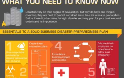
If there is one thing businesses should do this year, it is to create a disaster preparation plan. Natural disasters can take a devastating toll on a business, often times with no recovery. Disaster restoration companies can assist businesses put a solid plan in place to avoid downtime in the event of an emergency.
The Ultimate Social Media Guide to Getting a Job
Here is an infographic from the folks at CIPHR.com about how much you can further your career when you utilize social media, specifically hashtags, Twitter and Facebook.
The Most Incredible Luxury Items That Money Can Buy
The lives of the rich and the famous has always been a fascinating subject to most people in the United States. Whether it is reading about where they went on vacation or looking at pictures of their new mansion, it is always interesting to see what material objects and other things they choose to spend their money on.
Trending Tweens: How Kids Use Social Media
Tweens are all about social media these days. Check out the following infographic to learn about how kids are using social media.
The Most Expensive Divorce Settlements in History
Marriage is sadly not always for life. When a marriage breaks down, for whatever reason and if divorce mediation fails sometimes a financial settlement is the only option. Hollywood stars, famous sports players and even billionaires must too deal with the strain of divorce and often are involved in huge financial settlements.
9 Facts You May Not Know About Cancer
Following the success of last year’s campaign, this year the 4th of February marks ‘World Cancer Day 2014.’ It presents an opportunity to talk about cancer and help to dispel common rumors and misconceptions associated with the disease. Asons Solicitors are proud to promote the initiative, spreading the word through the following infographic.
Grocery Store Psychology: Tricky Marketing Tactics
Grocery stores employ psychological tricks to try get you to spend more. For example, many grocery stores place the most popular items in the center of the aisle. Do you wonder why? Check out the following infographic to learn their tricks of the trade.
The Staggering Cost of Stress On Your Business
The cost of stress affects several bodily functions and when we’re stressed, our brain gets washed with powerful hormones that are meant to help us in emergencies. So when we’re chronically stressed, these hormones can damage and kill brain cells. Needless to say, stress can really impede our work productivity and make us much more ineffective at our work. In fact, job stress costs U.S. companies $300 billion from turnover, absenteeism and loss of productivity.
Spiders of the Pacific Northwest
The first thing that pest control experts will tell you is that spiders are largely harmless. There are two medically significant species in the Pacific Northwest (the Black Widow and the Hobo Spider), but those species are unlikely to attack unless provoked. Still, spiders make it to the top of peoples’ lists of pests to get rid of.
Five Finger Internet Discount
Many people believe in the popular misconception that the free things that are available on the internet revolve around stealing, such as media downloads. Do you know that there are many legitimately free and legal things available online? Here we have an infographic by Hostgator showing the five finger internet discount.
Disaster Preparedness Plans, What You Need to Know
If there is one thing businesses should do this year, it is to create a disaster preparation plan. Natural disasters can take a devastating toll on a business, often times with no recovery. Disaster restoration companies can assist businesses put a solid plan in place to avoid downtime in the event of an emergency.
Partners






Browse Archives By Category
Animated Infographics
Business Infographics
Career & Jobs Infographics
Education Infographics
Entertainment Industry Infographics
Environmental Infographics
Finance & Money Infographics
Food & Drink Infographics
Health Infographics
Historical Infographics
Home & Garden Infographics
Internet Infographics
Law and Legal Infographics
Lifestyle Infographics
Marketing Infographics
Offbeat Infographics
Parenting Infographics
Pets & Animals Infographics
Political Infographics
Shopping Infographics
Sports and Athletic Infographics
Technology Infographics
Transportation Infographics
Travel Infographics
Video Infographics