


Search 12,100+ Infographics!
Everlasting Lessons from Mr. Rogers
Mr. Rogers was a reassuring voice to millions of children for over 45 years. Check out the infographic below to learn about some of Mr. Rogers everlasting life lessons.
Internet Crimes
The Internet provides a fairly infinite amount of opportunity. Unfortunately, some individuals view that as opportunity for criminal deeds. From spam to scams, there is a wide range of criminal activity that has sprung up online; much of which can land you behind bars.
How to Be More Creative
Fear is an enemy of creativity, the fear to get up and do something creative. Becoming more creative is a process, not an unreachable dream. By being open to, and with, your ideas, you can make the most of your creativity and find a way to spark ideas you can put into action. This infographic from tells us how we can start being more creative in our everyday lives.

Hungry Planet
This infographic by InternationalBusinessGuide.org looks at consumption around the Globe, including a look at per capita consumption, waste production, calories, and energy.
50 Insane Driving Laws From Around The World
Since the invention of the car in 1886, authorities around the world have devised a variety of rules and regulations for motorists. Whether you follow the Highway Code or le code de la route, there will be a comprehensive set of laws to follow, designed to protect both drivers and pedestrians from the dangers of the road. However, some driving laws are truly baffling.
LinkedIn Marketing Strategy
Grow your LinkedIn Networks to produce qualified leads with this 5 minute daily LinkedIn marketing plan designed for beginner, intermediate and advanced users. With these simple to follow steps and only 5 minutes a day you will soon be receiving more connection requests, more engagement and have more people viewing your profile.
Black Friday/Cyber Monday – Mobile Shopping Stats
How big of a part do mobile devices play on the biggest shopping weekend of the year? This infographic delves into some surprising stats from 2013 on the growth of mobile shopping.
The Ultimate Guide To Home Insurance
Home insurance is a $70 billion industry. According to a recent report, 95 percent of homes in the U.S. are insured. There are a number of benefits associated with home insurance. For homeowners, having a home insurance policy means being able to recover from financial blows that often arise as a result of natural disaster home damage, theft, accidental fires, and other unexpected home-related crises.
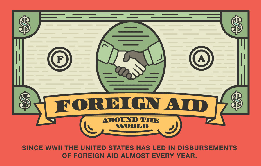
Foreign Aid Around the World
In 2012 the US sent 37.7 billion dollars overseas for foreign aid. A few reasons for this include: national security, commercial interests, and humanitarian concerns. Check out the infographic below to learn more.
The Risk of Attorney Malpractice
Being an attorney is a risky profession, particularly malpractice. According to the American Bar Association, malpractice claims are on the rise. Attorneys who take time to understand the most common reasons for malpractice and identify how their business could be impacted, can minimize their exposure to risk.
Everlasting Lessons from Mr. Rogers
Mr. Rogers was a reassuring voice to millions of children for over 45 years. Check out the infographic below to learn about some of Mr. Rogers everlasting life lessons.
Internet Crimes
The Internet provides a fairly infinite amount of opportunity. Unfortunately, some individuals view that as opportunity for criminal deeds. From spam to scams, there is a wide range of criminal activity that has sprung up online; much of which can land you behind bars.
How to Be More Creative
Fear is an enemy of creativity, the fear to get up and do something creative. Becoming more creative is a process, not an unreachable dream. By being open to, and with, your ideas, you can make the most of your creativity and find a way to spark ideas you can put into action. This infographic from tells us how we can start being more creative in our everyday lives.
Hungry Planet
This infographic by InternationalBusinessGuide.org looks at consumption around the Globe, including a look at per capita consumption, waste production, calories, and energy.
50 Insane Driving Laws From Around The World
Since the invention of the car in 1886, authorities around the world have devised a variety of rules and regulations for motorists. Whether you follow the Highway Code or le code de la route, there will be a comprehensive set of laws to follow, designed to protect both drivers and pedestrians from the dangers of the road. However, some driving laws are truly baffling.
LinkedIn Marketing Strategy
Grow your LinkedIn Networks to produce qualified leads with this 5 minute daily LinkedIn marketing plan designed for beginner, intermediate and advanced users. With these simple to follow steps and only 5 minutes a day you will soon be receiving more connection requests, more engagement and have more people viewing your profile.
Black Friday/Cyber Monday – Mobile Shopping Stats
How big of a part do mobile devices play on the biggest shopping weekend of the year? This infographic delves into some surprising stats from 2013 on the growth of mobile shopping.
The Ultimate Guide To Home Insurance
Home insurance is a $70 billion industry. According to a recent report, 95 percent of homes in the U.S. are insured. There are a number of benefits associated with home insurance. For homeowners, having a home insurance policy means being able to recover from financial blows that often arise as a result of natural disaster home damage, theft, accidental fires, and other unexpected home-related crises.
Foreign Aid Around the World
In 2012 the US sent 37.7 billion dollars overseas for foreign aid. A few reasons for this include: national security, commercial interests, and humanitarian concerns. Check out the infographic below to learn more.
The Risk of Attorney Malpractice
Being an attorney is a risky profession, particularly malpractice. According to the American Bar Association, malpractice claims are on the rise. Attorneys who take time to understand the most common reasons for malpractice and identify how their business could be impacted, can minimize their exposure to risk.
Partners


Browse Archives By Category
Animated Infographics
Business Infographics
Career & Jobs Infographics
Education Infographics
Entertainment Industry Infographics
Environmental Infographics
Finance & Money Infographics
Food & Drink Infographics
Health Infographics
Historical Infographics
Home & Garden Infographics
Internet Infographics
Law and Legal Infographics
Lifestyle Infographics
Marketing Infographics
Offbeat Infographics
Parenting Infographics
Pets & Animals Infographics
Political Infographics
Shopping Infographics
Sports and Athletic Infographics
Technology Infographics
Transportation Infographics
Travel Infographics
Video Infographics