


Search 12,100+ Infographics!
Is Hong Kong the New Tech Hub of China?
This infographic was inspired by the tech start-up culture that is currently blossoming in Silicon Harbour. It explores the population and connectivity of China’s biggest tech centres, the thriving start-up culture, and the role of the government in fostering Hong Kong’s stunning growth.
Netspeak Reveals Digital Divide
New research has revealed a large knowledge gap between parents and teens. Only 30% of parents accurately identified definitions for common internet terms such as “ASL” (“Age, Sex, Location”), “YOLO” (“you only live once”) and others. Check out the following infographic to learn how teens (and savvy adults) are communicating online.
All Rise: A Case Against Hourly Billing Legal Fees
The legal industries billing model needs to change. Hourly billing has proven to be an outdated and unfair model. Check out the infographic below presented by San Diego Law Firm to learn about hourly billing and how it’s not really beneficial to lawyers or their clients.
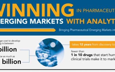
Winning in Pharmaceutical Emerging Markets with Analytics
Over the next five years, two-thirds of pharmaceutical sales growth will come from emerging markets. How can companies capture these new opportunities? By using big data of course. Check out the infographic below to learn more about how big data can help companies gain access to the pharmaceutical sales growth.
YouTube Sensationalism
In 1968, Andy Warhol was quoted as saying “In the future, everyone will be world-famous for 15 minutes.” YouTube has, by and large, facilitated the realization of this prophecy. Learn more about “YouTube Sensationalism” in this infographic by Hostgator.
Making a Splash: Fast and Fascinating Water Facts
Water: seems like humans have been fascinated with it since the beginning of time. We drink it, play in it and can’t live without it. Check out the following infographic to learn some interesting facts about water and swimming.
10 Fastest Supercomputers
The computer has become one of the most ubiquitous tools in everyday life, but supercomputers blow even the most advanced desktops out of the water. Comprised of tens of thousands of processors working in conjunction, supercomputers are capable of crunching numbers at astounding speeds.
What You Should Know While Traveling
In 2012, the number of international travelers surpassed the 1 billion mark for the first time in history. With summer upon us, perhaps it’s time for another vacation? As prices increase, being aware of any additional costs will help you save money in the long run. Take a look at the following infographic for some facts and money-saving tips as you plan your next journey abroad.
Top 7 Reasons to Spend Your Summer in Las Vegas
What about summer makes this time of year so great? Is it the sunshine? The days by the pool? The warm nights, late parties, or the feeling that it’ll never end? It’s hard to define why we love this season, but as far as summertime goes, Las Vegas must be doing something right. Every year this sunny destination attracts almost 35 million tourists from around the world (9 million of them choosing to visit during the summer months)—and there’s more than one reason.
Writing For the Web
This infographic entails interesting tidbits about how people read content on the web and it offers some helpful tips on how to make content eye catching.
Is Hong Kong the New Tech Hub of China?
This infographic was inspired by the tech start-up culture that is currently blossoming in Silicon Harbour. It explores the population and connectivity of China’s biggest tech centres, the thriving start-up culture, and the role of the government in fostering Hong Kong’s stunning growth.
Netspeak Reveals Digital Divide
New research has revealed a large knowledge gap between parents and teens. Only 30% of parents accurately identified definitions for common internet terms such as “ASL” (“Age, Sex, Location”), “YOLO” (“you only live once”) and others. Check out the following infographic to learn how teens (and savvy adults) are communicating online.
All Rise: A Case Against Hourly Billing Legal Fees
The legal industries billing model needs to change. Hourly billing has proven to be an outdated and unfair model. Check out the infographic below presented by San Diego Law Firm to learn about hourly billing and how it’s not really beneficial to lawyers or their clients.
Winning in Pharmaceutical Emerging Markets with Analytics
Over the next five years, two-thirds of pharmaceutical sales growth will come from emerging markets. How can companies capture these new opportunities? By using big data of course. Check out the infographic below to learn more about how big data can help companies gain access to the pharmaceutical sales growth.
YouTube Sensationalism
In 1968, Andy Warhol was quoted as saying “In the future, everyone will be world-famous for 15 minutes.” YouTube has, by and large, facilitated the realization of this prophecy. Learn more about “YouTube Sensationalism” in this infographic by Hostgator.
Making a Splash: Fast and Fascinating Water Facts
Water: seems like humans have been fascinated with it since the beginning of time. We drink it, play in it and can’t live without it. Check out the following infographic to learn some interesting facts about water and swimming.
10 Fastest Supercomputers
The computer has become one of the most ubiquitous tools in everyday life, but supercomputers blow even the most advanced desktops out of the water. Comprised of tens of thousands of processors working in conjunction, supercomputers are capable of crunching numbers at astounding speeds.
What You Should Know While Traveling
In 2012, the number of international travelers surpassed the 1 billion mark for the first time in history. With summer upon us, perhaps it’s time for another vacation? As prices increase, being aware of any additional costs will help you save money in the long run. Take a look at the following infographic for some facts and money-saving tips as you plan your next journey abroad.
Top 7 Reasons to Spend Your Summer in Las Vegas
What about summer makes this time of year so great? Is it the sunshine? The days by the pool? The warm nights, late parties, or the feeling that it’ll never end? It’s hard to define why we love this season, but as far as summertime goes, Las Vegas must be doing something right. Every year this sunny destination attracts almost 35 million tourists from around the world (9 million of them choosing to visit during the summer months)—and there’s more than one reason.
Writing For the Web
This infographic entails interesting tidbits about how people read content on the web and it offers some helpful tips on how to make content eye catching.
Partners


Browse Archives By Category
Animated Infographics
Business Infographics
Career & Jobs Infographics
Education Infographics
Entertainment Industry Infographics
Environmental Infographics
Finance & Money Infographics
Food & Drink Infographics
Health Infographics
Historical Infographics
Home & Garden Infographics
Internet Infographics
Law and Legal Infographics
Lifestyle Infographics
Marketing Infographics
Offbeat Infographics
Parenting Infographics
Pets & Animals Infographics
Political Infographics
Shopping Infographics
Sports and Athletic Infographics
Technology Infographics
Transportation Infographics
Travel Infographics
Video Infographics