


Search 12,100+ Infographics!
Possible Causes of The Military Suicide Epidemic
It is not the fear and the terror that service members endure in the battlefield that inflicts most psychological damage, but feelings of shame and guilt related to the moral injuries they suffer. This infographic presents some of the main causes of suicide among armed forces officers.
Ditch the Tie, Dad Wants Bacon!
Want to know what your dad really wants for Father’s day? Bacon. Yes, that’s right, he would probably have some nice crispy bacon than a tie or socks. Check out the infographic below presented by Oscar Mayer to learn about what your dad really wants for Father’s day.
Private Jet vs Commercial Airline
The following infographic provides a comparison of flying by private jet vs commercial airline. The Gulfstream G550 was used as a benchmark for the private jets and the A380 Airbus for commercial airlines. The figures are in pounds but nevertheless, quite interesting.

What TV Dad is Most Like Yours?
Is your dad the coolest man walking like Mad Men’s Don Draper or is he the ultimate family comedian like The Cosby Show’s Cliff Huxtable? Take the quiz to find out which TV dad is most like your own!

Your Pennies Are Worth More Than You Think
Do you know how far your pennies could go across the world? This infographic shows you how far your money could go that you’re using through their app. The results may shock you.
Evolution of Shopping
Shopping has existed in some form or another for just about as long as humankind has been around. We have gone from thumbing our way through mail-order catalogs to making purchases at the click of a button. Our buying habits evolve as the technology advances. Learn more about how shopping has evolved in this infographic.
A Toast to Wine
American’s are wine lovers, that’s for sure. They now make up the largest wine market in the world. Check out the infographic below presented by SpareFoot to learn more about America’s love of vino.
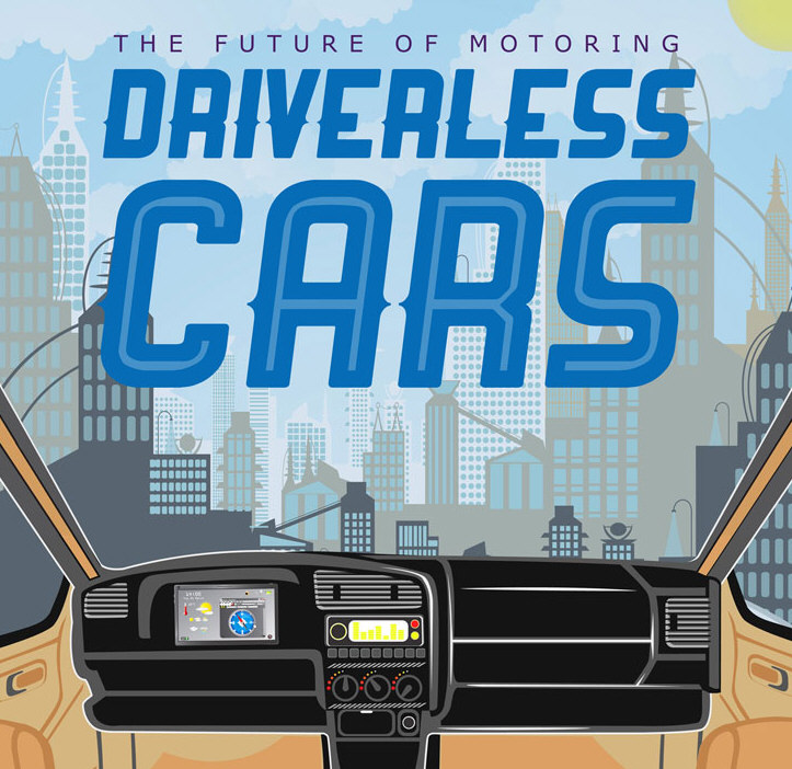
Driverless Cars: The Future of Motoring
Driverless cars have often been talked about as the future of motoring, but it seems that they are now far closer to becoming reality than is generally realized. Here is an infographic that looks at who is currently leading the race to dominate this industry which promises to revolutionize the motoring landscape.
Relapse: The Revolving Door
Oftentimes, relapse seems like a revolving door – an endless cycle of addiction, intervention, treatment, recovery, and relapse. The vicious cycle begins again. But why does it have to be that way? Why can’t your friend, child, or relative just quit? Learn more about this issue in the following infographic from Clarity Way.
How the IRS Abused the 501c Tax Loophole
The IRS has a known history of scandalous behavior. With Nixon, Johnson, Hoover, Kennedy, and the FBI using the IRS to intimidate their enemies, it’s no surprise that people have their eye on the IRS. Now under President Obama, they’re at it again, which begs the question: bureaucratic blunder or political profiling? The following infographic from TopAccountingDegrees.org explores this issue.
Possible Causes of The Military Suicide Epidemic
It is not the fear and the terror that service members endure in the battlefield that inflicts most psychological damage, but feelings of shame and guilt related to the moral injuries they suffer. This infographic presents some of the main causes of suicide among armed forces officers.
Ditch the Tie, Dad Wants Bacon!
Want to know what your dad really wants for Father’s day? Bacon. Yes, that’s right, he would probably have some nice crispy bacon than a tie or socks. Check out the infographic below presented by Oscar Mayer to learn about what your dad really wants for Father’s day.
Private Jet vs Commercial Airline
The following infographic provides a comparison of flying by private jet vs commercial airline. The Gulfstream G550 was used as a benchmark for the private jets and the A380 Airbus for commercial airlines. The figures are in pounds but nevertheless, quite interesting.
What TV Dad is Most Like Yours?
Is your dad the coolest man walking like Mad Men’s Don Draper or is he the ultimate family comedian like The Cosby Show’s Cliff Huxtable? Take the quiz to find out which TV dad is most like your own!
Your Pennies Are Worth More Than You Think
Do you know how far your pennies could go across the world? This infographic shows you how far your money could go that you’re using through their app. The results may shock you.
Evolution of Shopping
Shopping has existed in some form or another for just about as long as humankind has been around. We have gone from thumbing our way through mail-order catalogs to making purchases at the click of a button. Our buying habits evolve as the technology advances. Learn more about how shopping has evolved in this infographic.
A Toast to Wine
American’s are wine lovers, that’s for sure. They now make up the largest wine market in the world. Check out the infographic below presented by SpareFoot to learn more about America’s love of vino.
Driverless Cars: The Future of Motoring
Driverless cars have often been talked about as the future of motoring, but it seems that they are now far closer to becoming reality than is generally realized. Here is an infographic that looks at who is currently leading the race to dominate this industry which promises to revolutionize the motoring landscape.
Relapse: The Revolving Door
Oftentimes, relapse seems like a revolving door – an endless cycle of addiction, intervention, treatment, recovery, and relapse. The vicious cycle begins again. But why does it have to be that way? Why can’t your friend, child, or relative just quit? Learn more about this issue in the following infographic from Clarity Way.
How the IRS Abused the 501c Tax Loophole
The IRS has a known history of scandalous behavior. With Nixon, Johnson, Hoover, Kennedy, and the FBI using the IRS to intimidate their enemies, it’s no surprise that people have their eye on the IRS. Now under President Obama, they’re at it again, which begs the question: bureaucratic blunder or political profiling? The following infographic from TopAccountingDegrees.org explores this issue.
Partners


Browse Archives By Category
Animated Infographics
Business Infographics
Career & Jobs Infographics
Education Infographics
Entertainment Industry Infographics
Environmental Infographics
Finance & Money Infographics
Food & Drink Infographics
Health Infographics
Historical Infographics
Home & Garden Infographics
Internet Infographics
Law and Legal Infographics
Lifestyle Infographics
Marketing Infographics
Offbeat Infographics
Parenting Infographics
Pets & Animals Infographics
Political Infographics
Shopping Infographics
Sports and Athletic Infographics
Technology Infographics
Transportation Infographics
Travel Infographics
Video Infographics