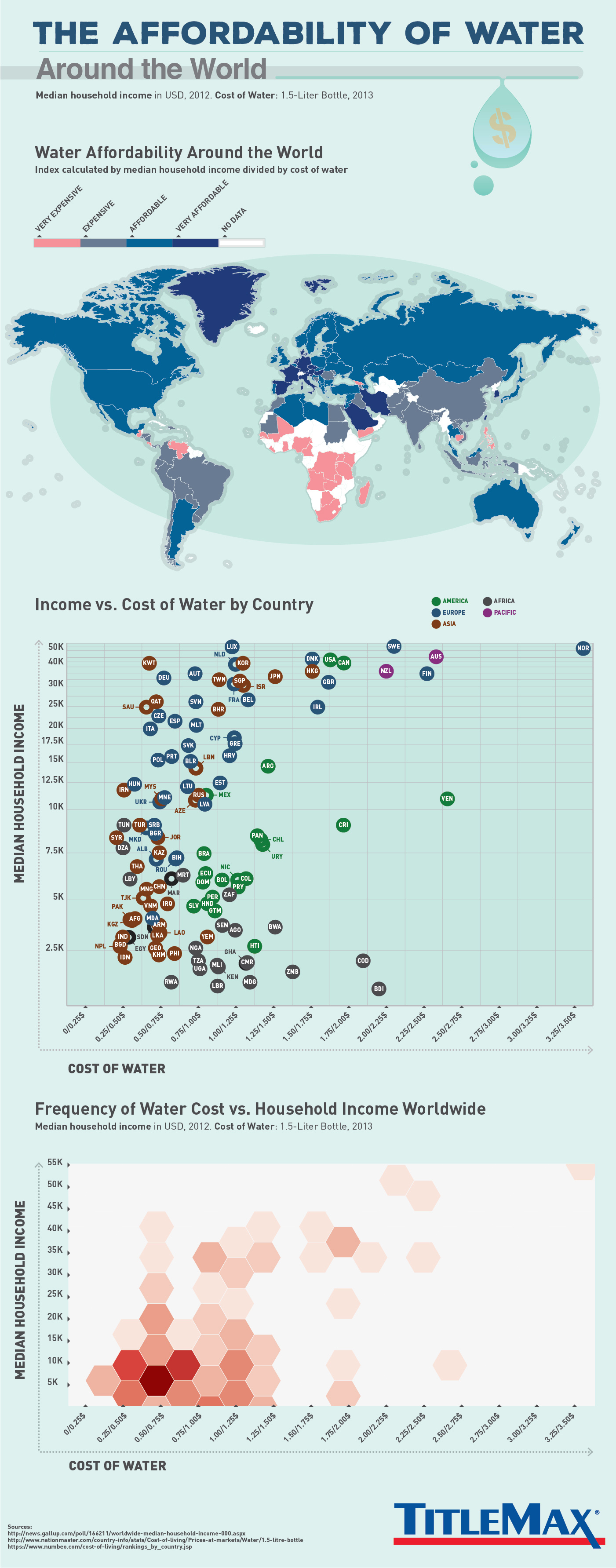
Where in the world does clean drinking water take up a great deal of one’s paycheck? In the following infographic, TitleMax.com painted a more detailed picture by comparing median household income in several countries and comparing it against the cost of a 1.5 liter bottle of water.
The first chart is a heatmap showing the ratio of the two, the second is a scatterplot with each point representing a country, and last is the frequency chart showing the reality for most people in the world. As the water crisis will likely get worse in the upcoming years, it’s important to remember that scarcity events will affect the world’s population disproportionately.
[Click image for full size version]
Co-founder and Vice President of SearchRank, responsible for many of the day to day operations of the company. She is also founder of The Arizona Builders' Zone, a construction / home improvement portal.


