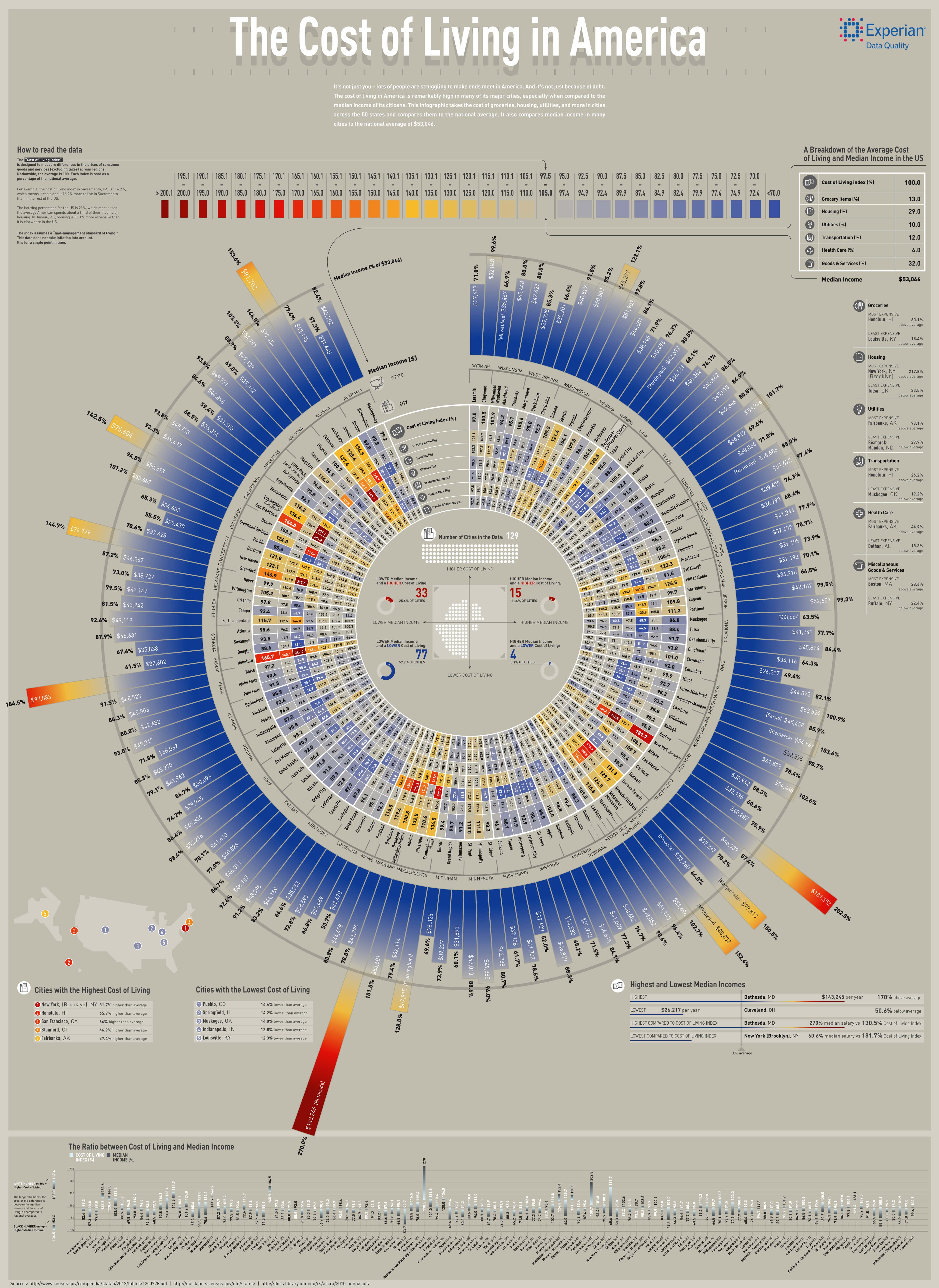
This infographic by EDQ.com takes the cost of living and compares it to the median income across 129 cities, across all 50 states in America. The cost of living is calculated as a composite index – meaning it takes the cost of things like groceries, healthcare, transportation, and other daily costs and factors them together.
Each element is weighted and put together to provide a score which is compared to the national average. So what you have in this infographic is each individual city with its median income and cost of living for various factors compared against the national average.


