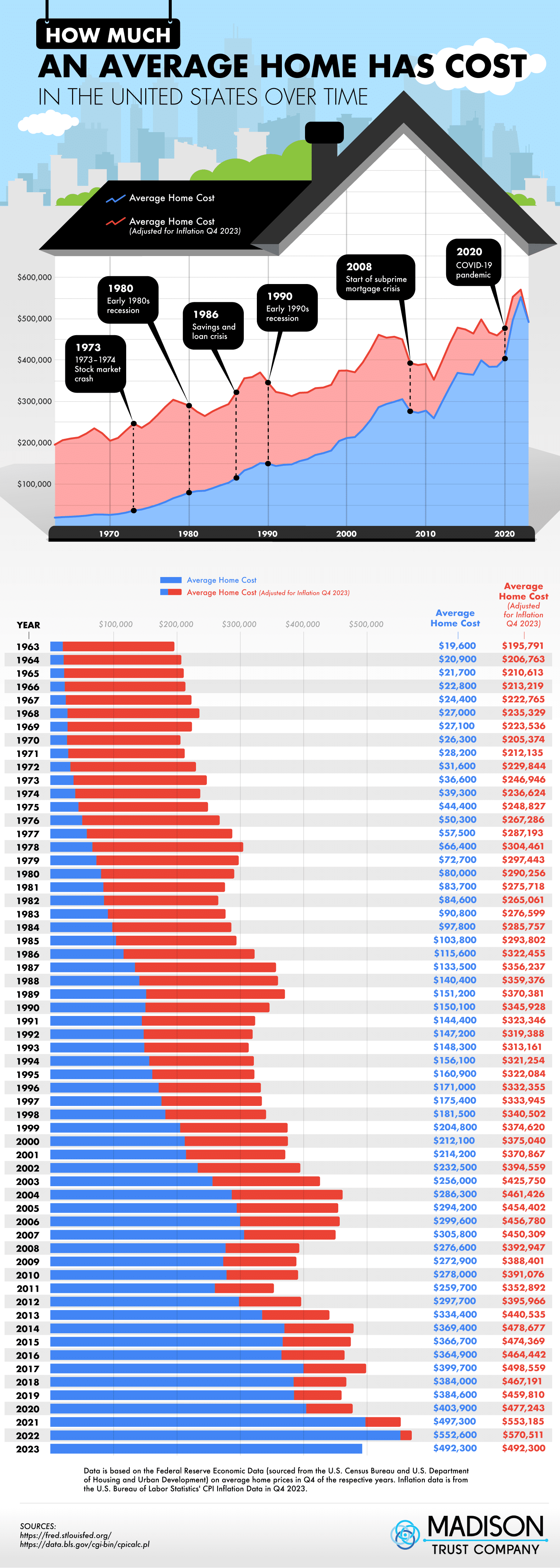
It’s all over the news and on display in this graphic from Madison Trust Company: home prices are rising dramatically. This graph shows the average American home price every year since the 60s. The information includes the average cost alongside the price adjusted for inflation.
Looking at the numbers here, we can certainly see why housing costs are making headlines. Although there are a lot of dips and years with downward trends, overall, the average home price has increased dramatically over the decades.


