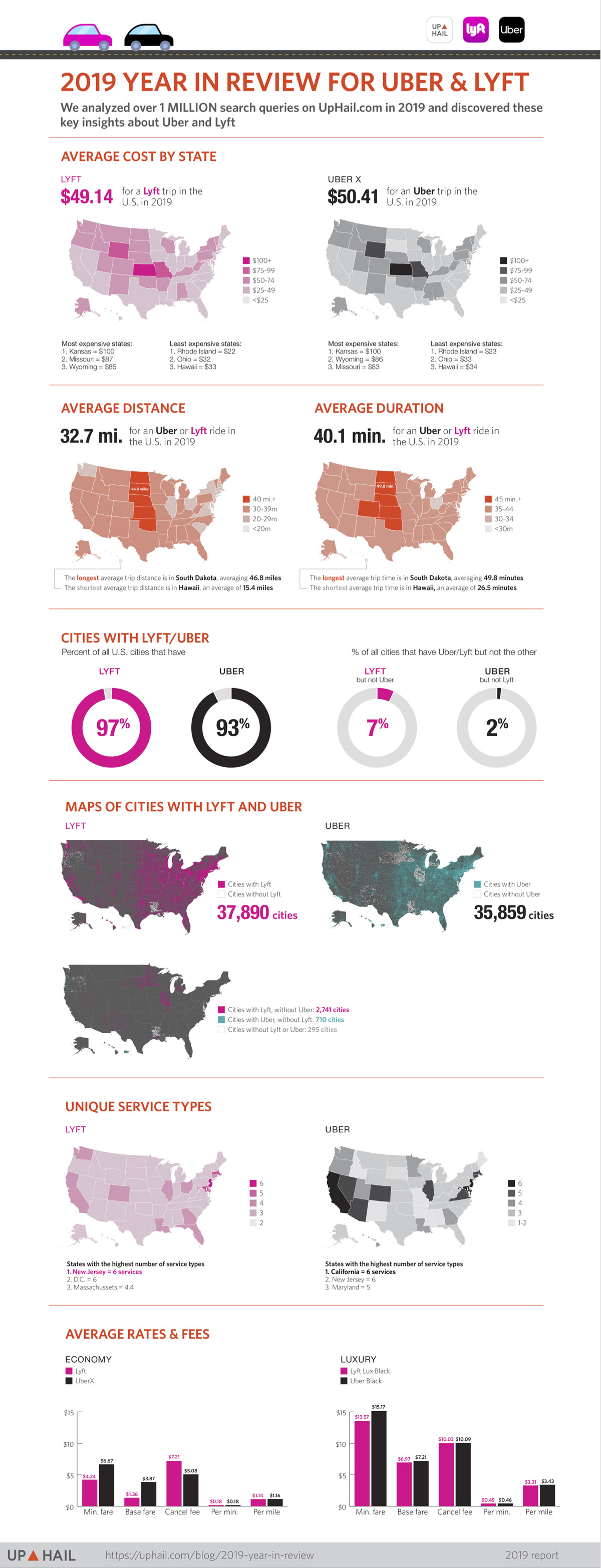
Over 1 million unique search queries occurred on Up Hail in 2019 in the US. Using this data set, their data science and visualization team analyzed and discovered key insights about Uber & Lyft with regards to coverage area, pricing, services offered, average distance and duration of trips. In the following infographic, you will find some interesting stats and figures that may surprise you.
[Click here for full size version]
Irma Wallace
Co-founder and Vice President of SearchRank, responsible for many of the day to day operations of the company. She is also founder of The Arizona Builders' Zone, a construction / home improvement portal.


