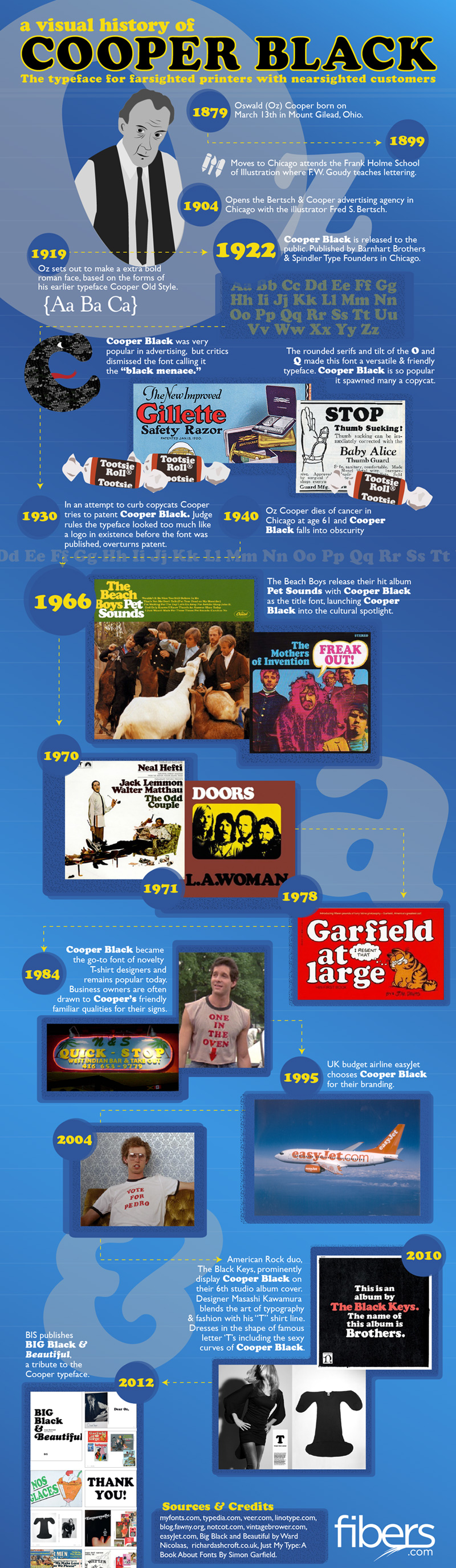
You might not know it, but you’ve seen the Cooper Black font in use everywhere – in store-fronts, in magazines, on album covers and candy wrappers. This depression era novelty font gets around. And why wouldn’t it? It’s curvaceous and friendly, as the type designer who created this font said, “It’s a typeface for farsighted printers with nearsighted customers.” Fibers thinks Cooper Black is just lovely, with a rich and robust history. They therefore put that history down visually in the following infographic.
[Click image for full size version]
Co-founder and Vice President of SearchRank, responsible for many of the day to day operations of the company. She is also founder of The Arizona Builders' Zone, a construction / home improvement portal.

